
Be The One They Remember.
We design the brand identity, the logo, look, and language, that makes building industry companies unmistakable, so buyers and AI choose you first.
What Is Brand Identity in the Building Industry?
Brand identity in the building industry is the system of visual and verbal choices, the logo, color, type, naming, photography, and voice, that makes your company recognizable and tells buyers, partners, and AI search engines exactly who you are and why you are the right choice. Across manufacturers, distributors, dealers, lumberyards, associations, co-ops, and service and tech providers.
Brand identity is what separates a company buyers remember from three competitors they cannot tell apart.
When Everyone Looks the Same, Buyers Decide on Price.
The market is changing around you, and you can feel it. Buyers and partners used to meet you first and judge the work. Now they judge the look first and decide whether to meet you at all. They find you on a phone, in a search result, in a list an AI built for them, and in a half-second they slot you into “looks like a serious company” or “looks like everyone else.”
When your identity blends in, your reputation cannot do its job. The work is the same and the team is the same, but the company that looks sharper, clearer, and more sure of itself gets the call. You get compared on price, because price is the only difference a buyer can see.
The Deals
Work you should win, lost to a company that only looks more polished than you.
The Partners
Distributors and reps who never reach out, because you did not look established enough.
The Talent
The hires who pick a competitor that looks like it is going somewhere.
The Pricing Power
The premium you give away every time you blend into the crowd and compete on price.
Your First Impression Now Happens Without You in the Room.
The playbook that built your company, referrals, relationships, showing up, still works. It just starts later now. Before a buyer ever calls, two readers have already formed an opinion of you.
Both read the same thing. Your identity. A clear, consistent brand tells a human you are credible and tells an AI engine exactly what you are and who you serve. A scattered one tells both that you are a guess.
If AI cannot understand you, it cannot recommend you.
Differentiation Is Not Decoration.
It Is How You Get Chosen.
We know a logo can feel like the least urgent thing on your desk. But brand identity is not decoration, and it is not a color you happen to like. It is the difference between being remembered and being a line item. A great identity is a blueprint for how your company shows up everywhere: the same strong signal on your website, your trucks, your booth, your line cards, and the AI answer a buyer never sees you shape.
In plain terms: we design one clear, consistent look and language for your company, then we apply it everywhere your buyers find you, so you look like the same confident company every time.
Identity is one part of a larger system. Build Your Authority, our flagship engagement, runs your identity, website, visibility, and media together so the recognition keeps compounding. Not ready for the full system? A Strategy Day is the low-commitment way to start.
How We Build an Identity That Sticks.
Three steps from blending in to unmistakable. The last one never stops working.
Discover It
We learn your company from the inside, your history, your edge, your buyers, and find the one thing that makes you different.
Design It
We design your logo, color, type, voice, and guidelines into one clear identity system, and we apply it everywhere buyers find you.
Run It →
Inside Build Your Authority, we put your new identity to work across your website, your visibility, and your media, and we keep it sharp as you grow.
Most identities take about four to eight weeks, depending on scope, from a focused logo and visual refresh to a full rebrand with naming, guidelines, and applications. You can start with brand identity on its own, or fold it into an ongoing engagement. The strategy call scopes it to your goals, so you never overspend or underbuild.
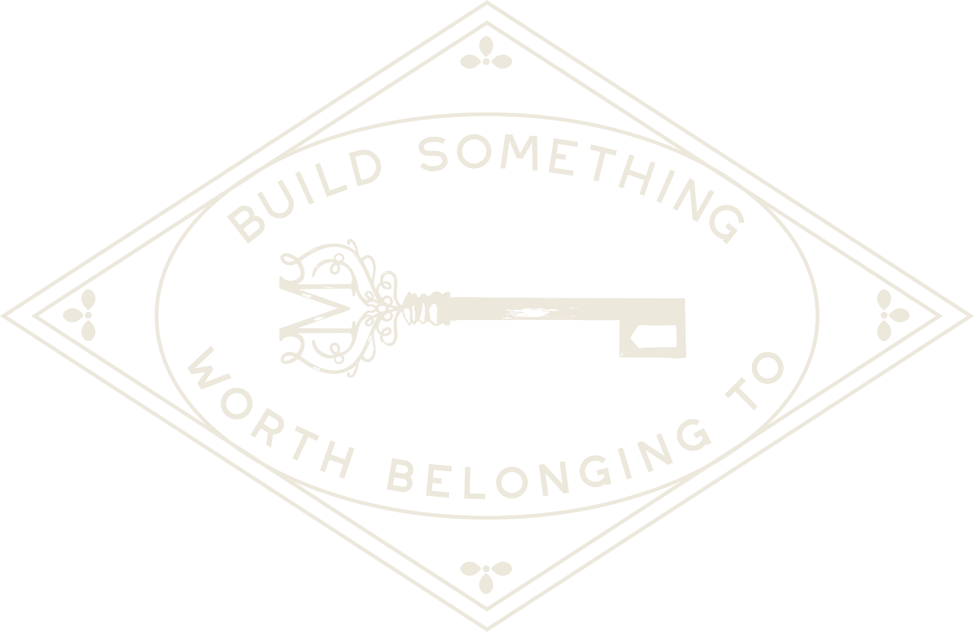
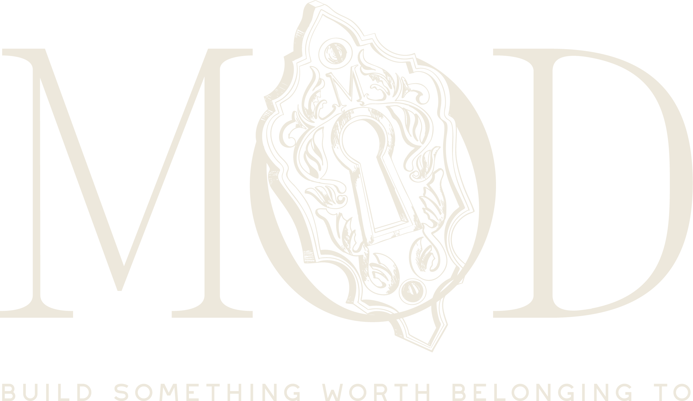
Our Premiere Spotlight.
We built the entire MOD brand for Lew Oliver Inc., from name and mark to color, type, and a concept website. Proof beats promises.
Grit Blueprint helped us bring the MOD Collection to life. Stefanie and her team shaped the marketing materials, the logo, the graphics, and the thinking behind how we change the public perception of modular construction. They helped us position MOD Collection as superior construction, with high-quality, elegant finishes and a clear role in the future of walkable neighborhoods. Grit is creative, energetic marketing that brings clarity and purpose to the surface.
You took these ideas and transformed them into blueprints, as you do, and gave us an entire suite of options for marketing, for leading conversations with prospective clients, and a blueprint to adhere to internally. You produced the information in a new way we hadn’t even thought of ourselves. You showed us so much creativity, and that is critical for us. We can’t be a design firm and present information in a non-creative way. Your process, and what you produced, was perfectly in line for us.
What Building Industry Leaders Say.
Real companies in the building industry, made unmistakable. In their own words.
“Stefanie’s group helped us bring the MOD Collection to life, shaping the marketing materials, logo, graphics, and the thinking behind how we change the public perception of modular construction. They helped us position MOD as superior construction with high quality, elegant finishes, and a clear role in the future of walkable neighborhoods.”

“Stefanie has been my brand building guru. She helped define, nurture, and grow my brand. Her team built my speaking website, integrated e-commerce, created my brand standards, and crafted a social media strategy. I trust her as equal parts mentor, peer, and badass inspiration!”

“Stefanie and the Grit Blueprint team provided marketing and two complete website rebuilds for our main and millwork brands. Their experience in the building supply industry and creativity simplified everything for us and delivered results beyond our expectations. Highly recommend!”

“Stefanie and her team are building something that fills a critical need in our industry. They bring the expertise most family-owned businesses cannot access on their own. Highly recommend Grit Blueprint for industry businesses who want to grow reputation and revenue.”

Once Your Identity Is Set, We Put It to Work.
A brand only matters where people see it. Two parts of the Grit Blueprint platform carry yours into the industry.

Media That Looks Like You
Our production studio creates photography, video, and content built on your new identity, so every asset reinforces the same recognizable brand instead of diluting it.
Seen by the Building Industry
Our media platform puts your brand in front of the manufacturers, distributors, dealers, and channel pros you are trying to reach. Media is proof, and it travels.
Before You Ask.
The word comes from cattle ranching. A rancher burned a mark into a cow so that anyone who saw it knew instantly whose herd it was and what that ranch stood for. The mark was not the cow, and it was not the ranch. It was the association between them.
That is still exactly what a brand is: an association between two things. It is what happens when the mind links one thing to another and lets the first stand for the second, a name to a promise, a product to a feeling of quality, a person to the single idea they own. When the link is strong enough, you stop having to explain yourself. The association does the work.
Today a brand is two things at once. It is the gut feeling people have about you, the reputation that lives in their heads. And it is the digitization of that reputation, a version of you that lives online and everywhere, in a search result and in the answer an AI gives when a buyer asks who to trust. A strong brand makes sure the reputation people feel and the one they find online are the same confident company.
Your brand is the gut feeling people have about you, the reputation that lives in their heads. Your brand identity is the system you build on purpose to shape that feeling: the logo, color, type, naming, photography, and voice. You cannot control your brand directly, but you control your identity, and a strong identity is how you steer the brand.
Because buyers cannot judge your product until after they have chosen you, and brand is what gets you chosen. When two companies offer the same quality, the one that looks clearer and more certain of itself wins, because clarity reads as competence. Brand is not the icing. It is the thing that decides whether anyone tastes the cake.
Six things working as one system: a logo and mark, a color palette, typography, a naming and messaging framework, a photography and graphic style, and a brand voice. On their own they are decorations. Together, applied consistently, they become a signal a buyer recognizes in half a second and an AI engine can read and repeat.
If your logo is holding the brand back, yes. A logo upgrade is not about taste. It is about making the mark clearer, bolder, and easier to recognize, so it reads instantly at a glance and stands out next to your competitors.
It also has to be practical. A modern logo is clean enough to reproduce anywhere, from a stitched cap to a trailer wrap to a favicon, and it is built as a full set of lockups, horizontal, vertical, and stacked, plus a standalone icon, so it works in every place your brand shows up. A good logo is not just nicer to look at. It is the most flexible, hardest-working piece of your whole identity.
A logo suite is the full set of versions of your logo, built so you always have the right one for every place your brand shows up. One logo is never enough, because a mark that looks great on your website falls apart on a phone screen, a hat, or a tiny browser tab.
A complete suite usually includes a primary logo (the main, full version you use most of the time), a secondary logo (an alternate layout for tight or wide spaces where the primary does not fit), a stacked logo (the name and mark arranged vertically, for square or centered spots), a logo mark or icon (the symbol on its own, used when the full name is not needed or there is no room for it), a favicon (the tiny icon in a browser tab and bookmarks), and a social media icon (a version cropped and sized to read clearly inside the round and square avatars every platform uses).
They matter because consistency is what makes a brand recognizable, and consistency only survives if you have the right format for every situation. With a real suite, your brand looks sharp and intentional everywhere, from a billboard to a browser tab. Without one, people start stretching, cropping, and recoloring the logo to make it fit, and the brand falls apart one workaround at a time.
Color is the fastest thing the eye processes, faster than words or shapes, so it does the first work of recognition. A consistent, owned palette makes you recognizable before anyone reads a thing, and over time the color starts to mean you.
Color also carries feeling. Blue reads as trust and stability, black as premium, green as growth, red as urgency. The right palette makes a buyer feel something about you before they know a single fact about you, and the wrong one quietly works against you.
The bigger decision is whether your color helps you stand out or blend in. Most companies in the building industry reach for the same blues, grays, or greens, with blue and green the most common, which is exactly why they all look alike. The boldest move is often the unexpected one. Hot pink, for example, is one of the highest-converting colors in advertising, and almost no one in this industry uses it, which is a big part of why it stands out. The point is not the specific color. It is choosing one you can truly own, and then using it everywhere, on purpose.
Typography is simply the fonts you use and how you use them. It matters more than most people think, because type carries tone before a single word is read.
Different fonts feel like different things. A serif, the kind with small feet on the letters, tends to feel established, premium, even luxury. A clean sans serif feels modern, simple, and techy. Some fonts are built to be effortless to read, others to make a bold statement in a headline. The wrong choice can make a serious company look cheap, or a warm one look cold.
A real brand does not use one font, it uses a small system: usually a display or header font for big statements, a title font for sections, and a body font for everything you actually read. The body font has one job above all, to be easy to read and fast to load on a website, because that is the type your buyers spend the most time with. Chosen and used consistently, your type becomes one more thing people recognize as you.
Brand voice is how your company sounds in words: your vocabulary, your rhythm, your point of view, and the attitude behind them, kept consistent everywhere you show up.
It is bigger than it sounds. Voice is what makes a headline land, an email feel human, a sales page persuade, and a proposal sound like the same company that runs the website. It is the difference between sounding like a confident expert and sounding like a brochure. Done well, people can recognize you from a single sentence with your logo nowhere in sight.
Voice also does double duty now. Buyers read your words to decide if they trust you, and AI engines read the same words to decide what you are and whether to recommend you. A clear, consistent voice makes you credible to a person and legible to a machine. A scattered one makes you sound like a guess to both.
Brand guidelines are the one document that defines how your brand is used everywhere: your logo and its lockups, colors, type, photography, voice, and the rules and dos and don’ts that keep it all consistent.
They matter because a brand only works if it looks and sounds the same every time, and the moment more than one person touches it, consistency starts to slip. Guidelines keep everyone in line: your own team, your printer, your sign shop, your web developer, your ad vendors, and every partner who ever puts your name on something. They shape what your customers see too, so the brand feels like one company at every touchpoint.
Without guidelines, your identity drifts within a year and you are back to looking like four companies wearing one name. With them, the brand you paid to build compounds instead of eroding.
Brand is what lets you compete on value instead of price. When a buyer cannot tell you apart from three competitors, the only lever they have is price, and you lose margin every time. A strong identity gives them a reason to choose you that is not the cheapest number, which protects your pricing and your margin.
Yes. Buyers now ask Gemini, ChatGPT, Perplexity, and Claude before they ever call, and those engines build a shortlist from what they can read about you. A clear, consistent, well-structured brand tells an AI engine exactly what you are and who you serve, so it can understand, recommend, and cite you. If AI cannot understand you, it cannot recommend you.
Yes, you can start with brand identity on its own, and many companies do exactly that. Your timeline depends on scope, from a focused logo and visual refresh to a full rebrand with naming, guidelines, and applications. The fastest way to find out what you need is a strategy call, where we scope it to your goals.
Yes, and that focus is what you get the most out of. We design only for manufacturers, distributors, dealers, lumberyards, associations, co-ops, and the service and tech providers around them, so your brand looks and sounds like it belongs at the top of your category, never like a generic agency template.
A refresh sharpens what you already have: tighter logo, cleaner color and type, consistent application. A rebrand rethinks the foundation: positioning, name, and the whole system, usually after a merger, a new direction, or years of drift. You will know which one your business actually needs after the strategy call, so you do not overspend or underbuild.
A company brand is the reputation of the business. A personal brand is the reputation of a person inside it, usually a founder, owner, or executive. They are different, and the strongest companies build both, because people trust people. Buyers follow a face before they follow a logo, and in the building industry a known leader often opens doors the company name cannot.
Both are built the same way: a clear identity, applied consistently. A personal brand still needs its own colors, type, photography, and voice, designed to sit alongside the company brand without competing with it. When they work together, the person lends credibility and warmth to the company, and the company lends scale and staying power to the person.
You need both because they protect each other. If everything rides on one person, the business is fragile. If everything rides on the logo, you lose the trust only a human face earns. Build them as a system and each one makes the other stronger.
Your work is the best in the room.
Your brand should be
the one they remember.
Stay invisible and you keep competing on price against companies that only look more polished. Become unmistakable and the right buyers, partners, and hires choose you first. The difference is the identity you decide to build.
Or start with a Strategy Day