Client
Lew Oliver Inc.

In the building industry, most companies sound exactly alike. Here is how we made one of them unmistakable, and what doing the same could do for yours.
MOD by Lew Oliver Inc. is a collection of
architect-designed modular homes. Grit Blueprint built its entire brand identity, from name and mark to color, type, and a concept site.
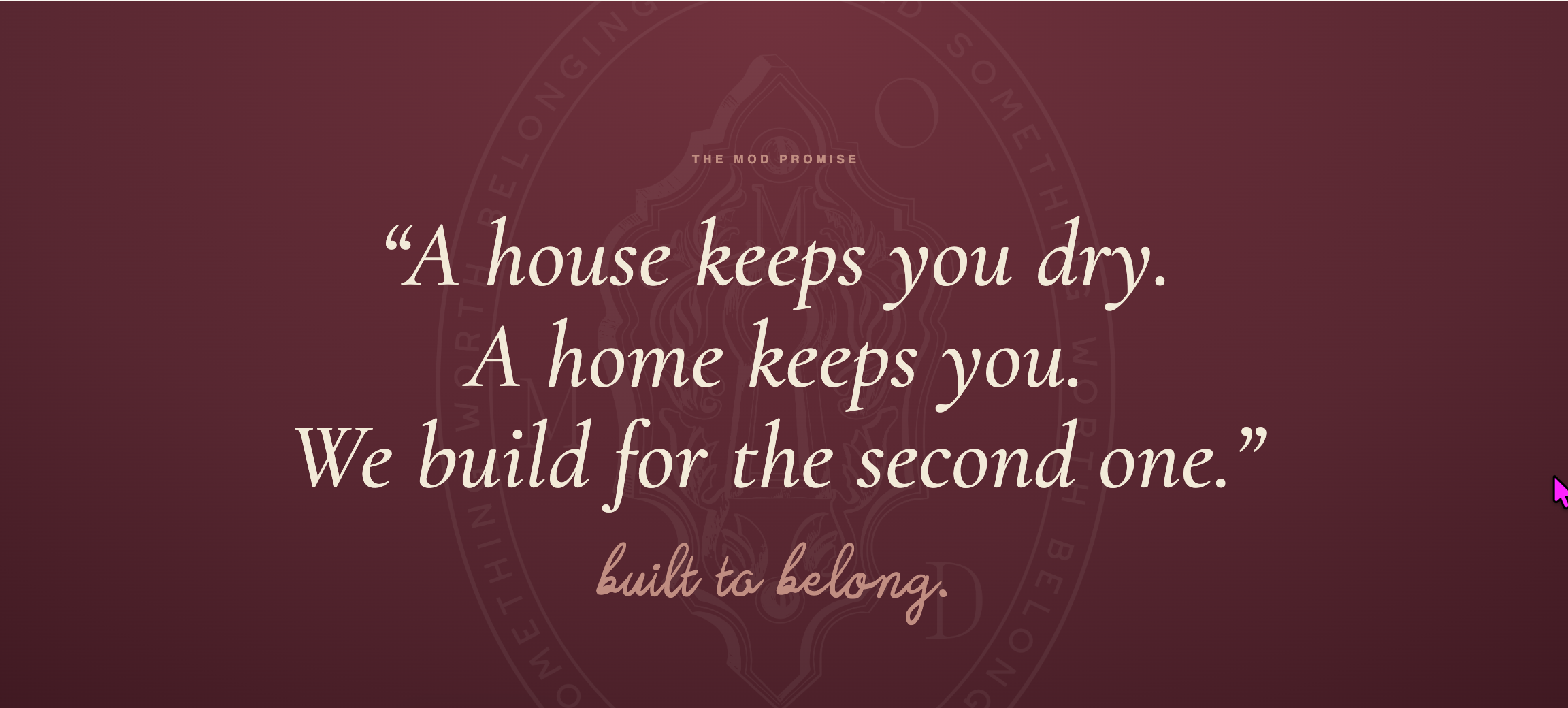
“Grit Blueprint is creative, energetic marketing that brings clarity and purpose to the surface.”
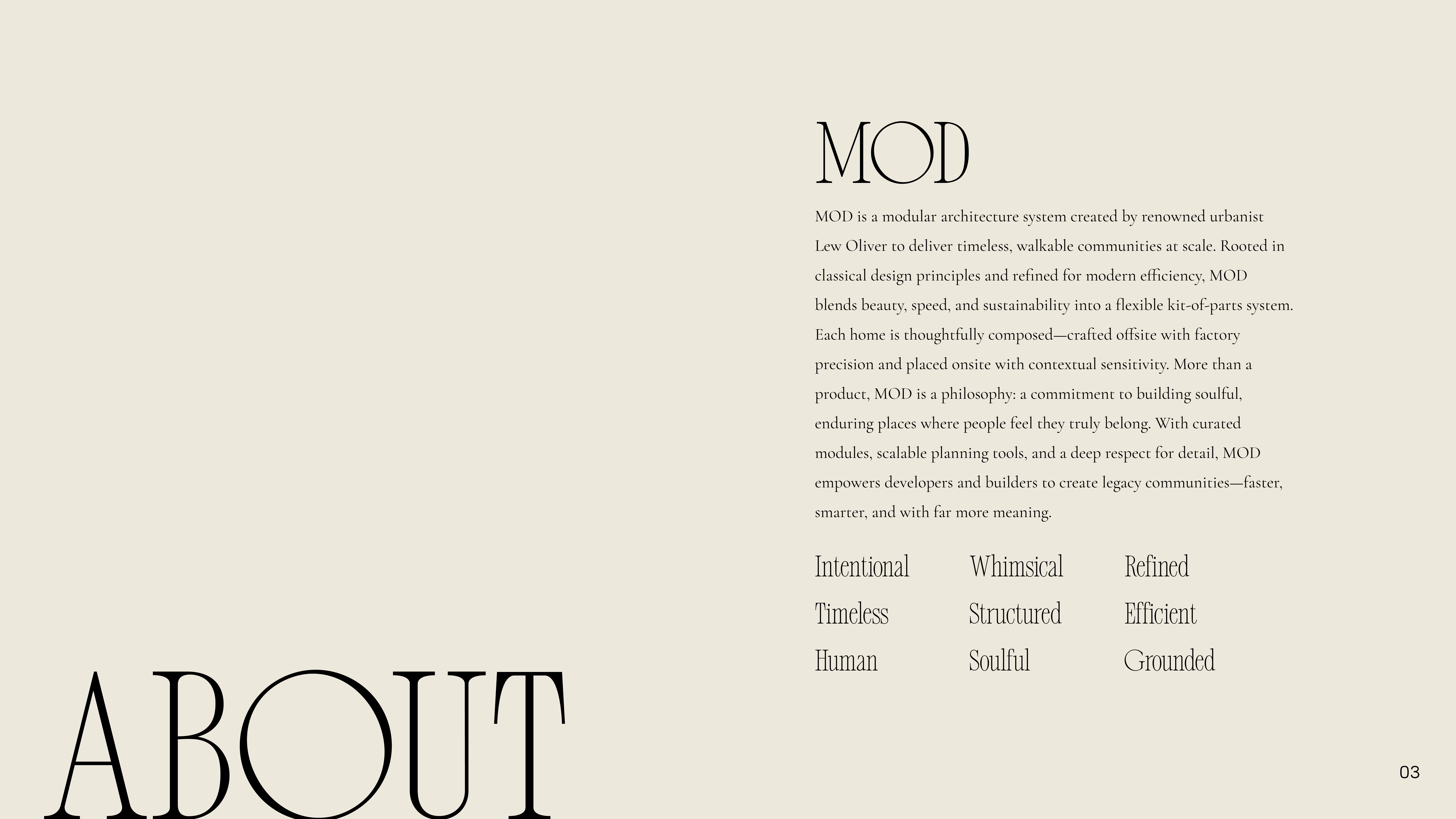
MOD by Lew Oliver Inc. launches into a market that has never heard the name. That part is expected, every new brand starts unknown. The real challenge is proving, in seconds, that this is not another commodity modular builder.
With no homes to point to yet, the brand carries all of that weight. It has to look like the category leader on day one.
The home designs are under NDA. You will see the brand we built to wrap them, never the plans.
MOD had to feel as serious as Lew Oliver’s award-winning work the moment anyone saw the name.
Modular still says “cheap” to most buyers. The brand had to say the opposite, instantly.
With no community to tour yet, the brand alone had to make developers and buyers want in.
We do not decorate. We build brands that make sales easier. Four moves took MOD from nothing to a name developers and buyers take seriously.
Multiple working calls with Lew to understand the man, the MOD vision, and the one thing only MOD could own.
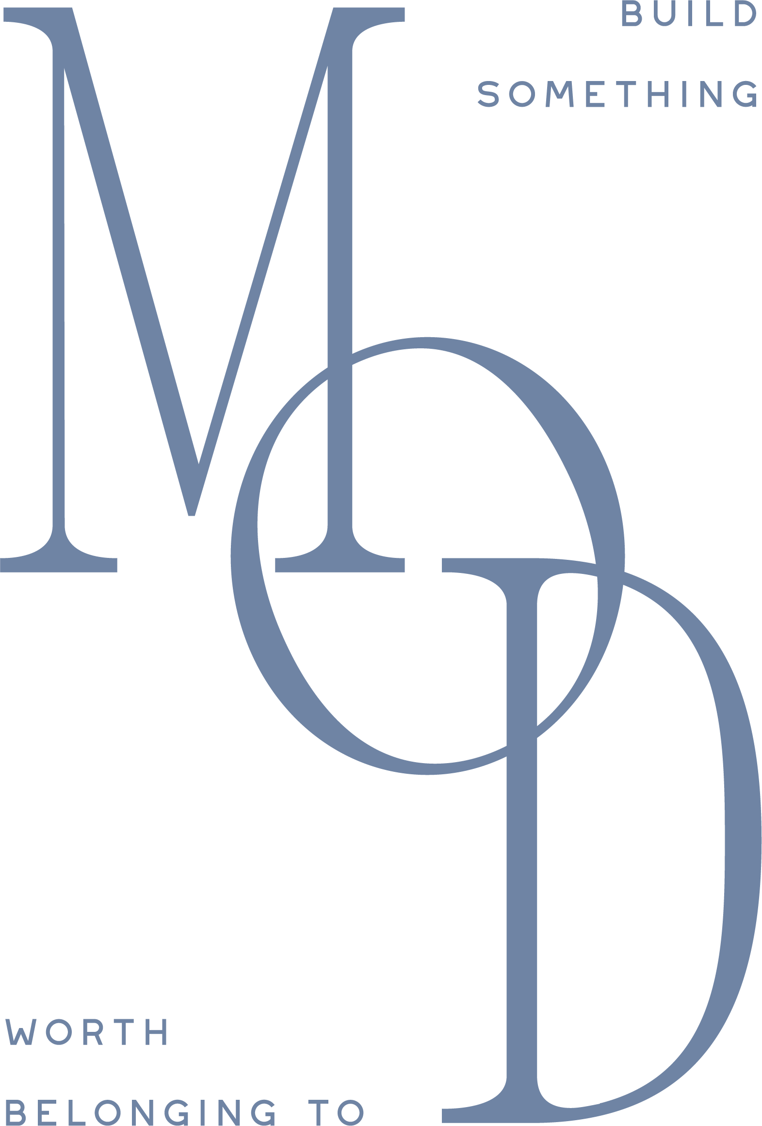
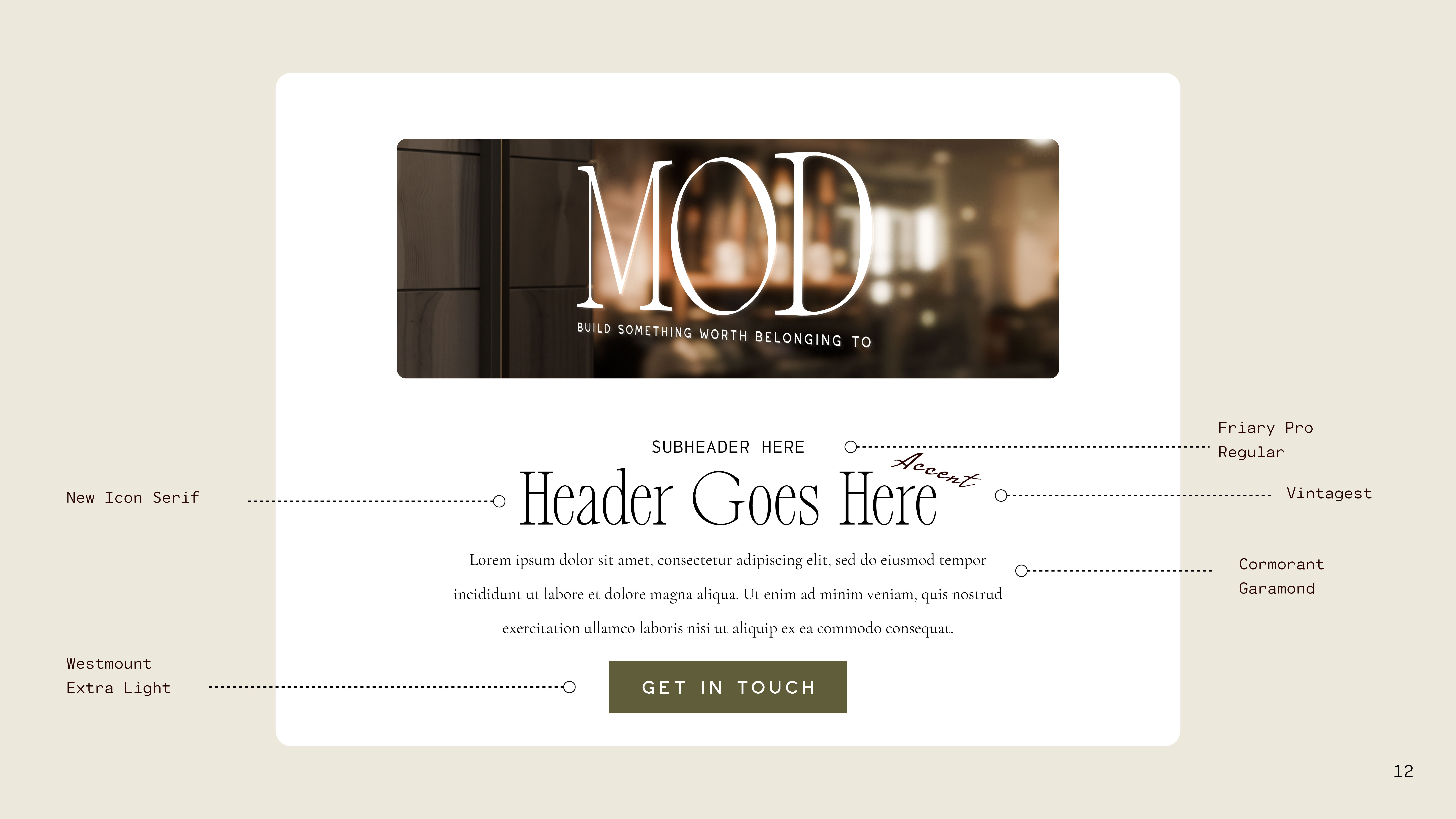
The name, the keyhole mark, the palette, and a type system that feels timeless, not trendy.
A full brand kit, logos, marks, emblems, taglines, color, and type, plus pitch decks and print collateral.
MOD is now out pitching developers and partners, getting ready to bring the collection fully to market.
 .
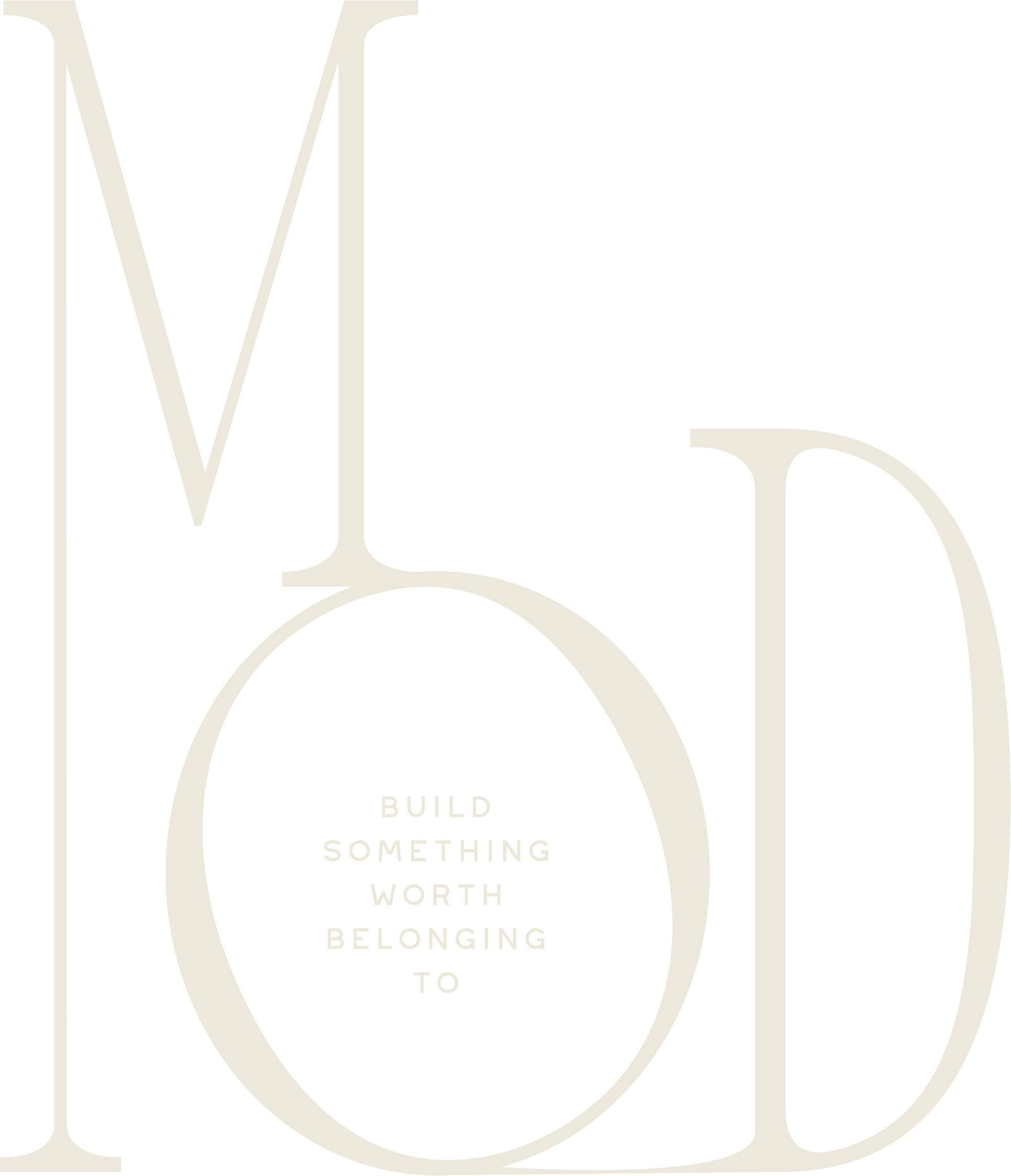
.An entire brand, designed from a blank page, and the tools to take it to market.
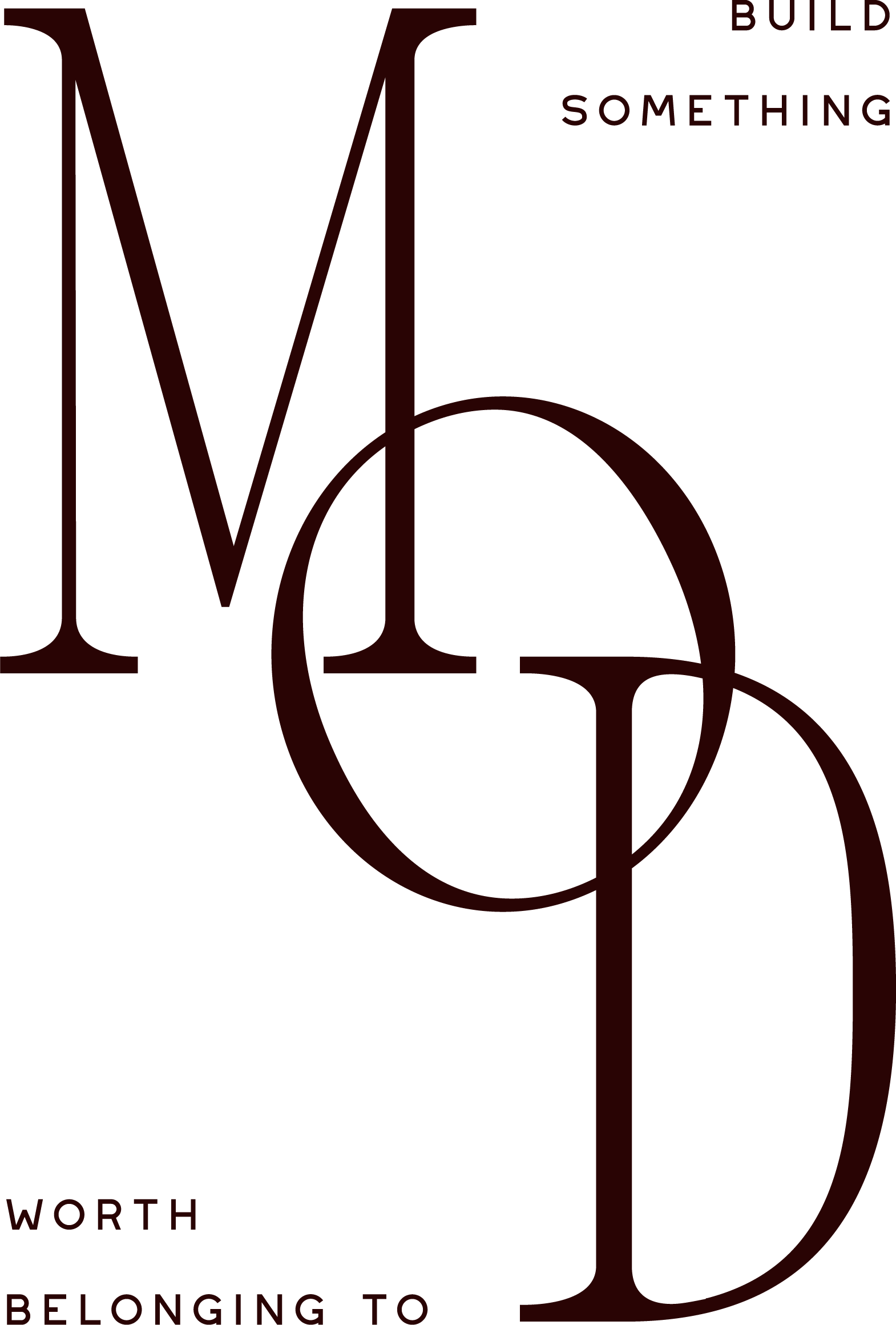
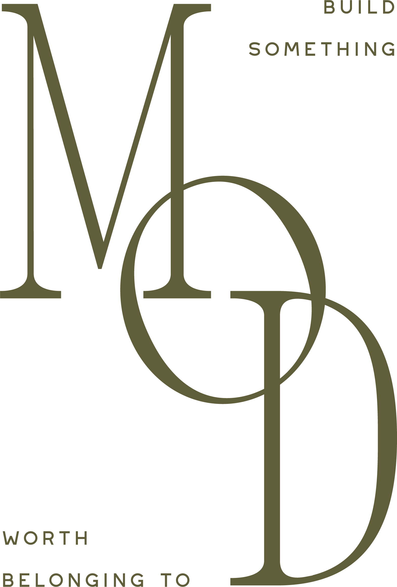
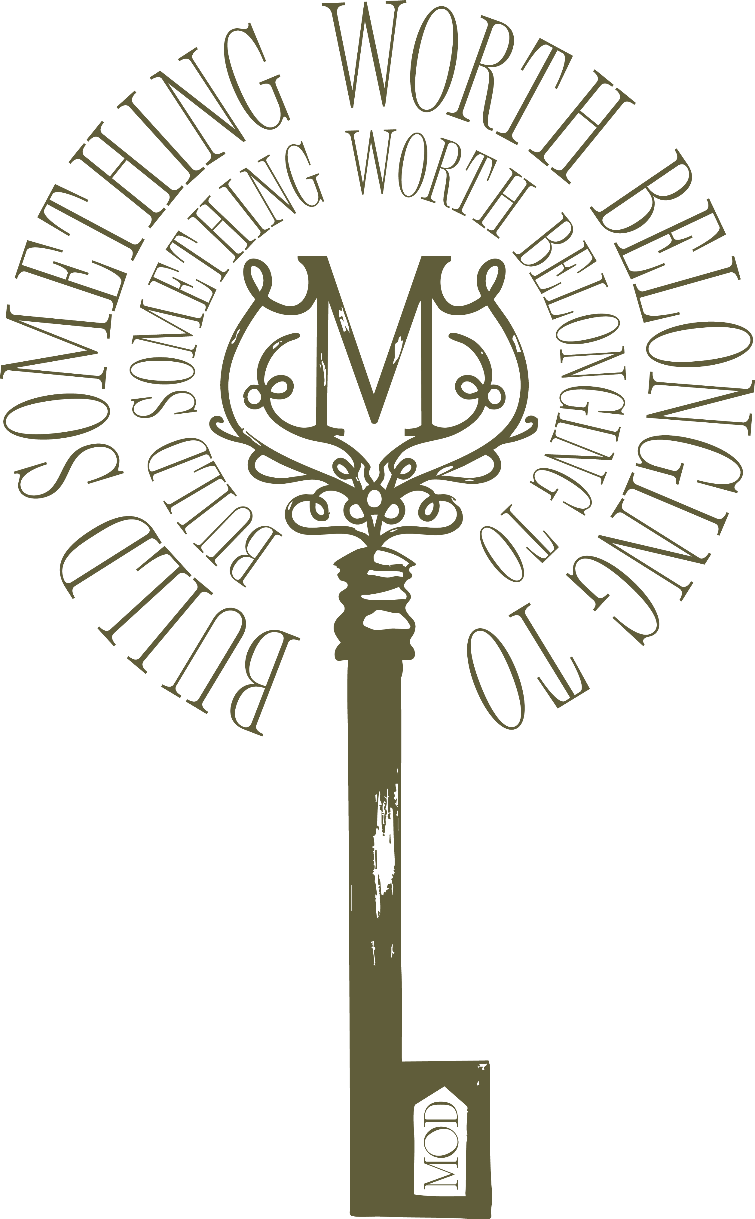
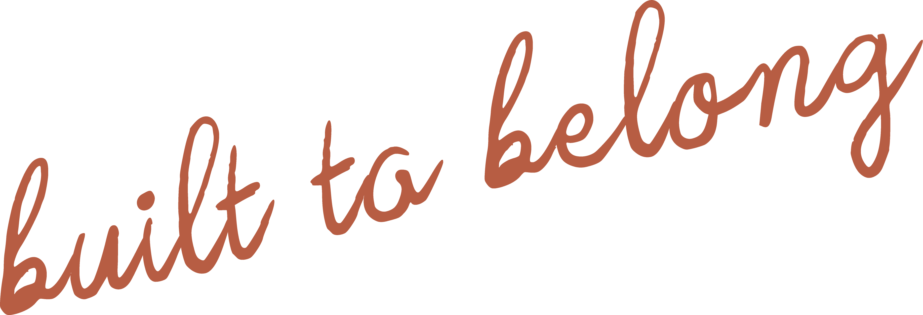
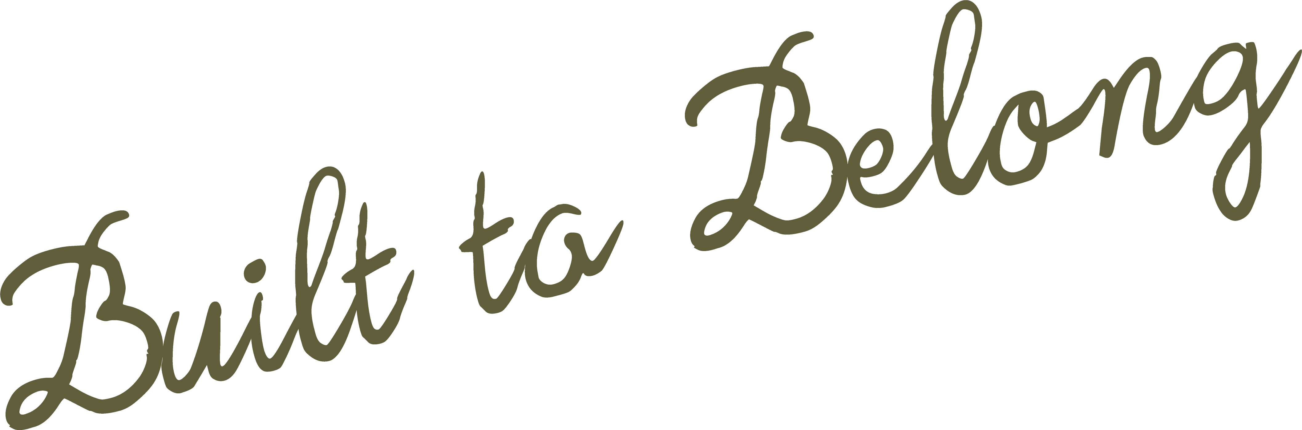
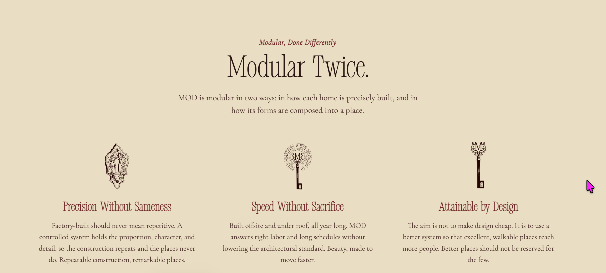
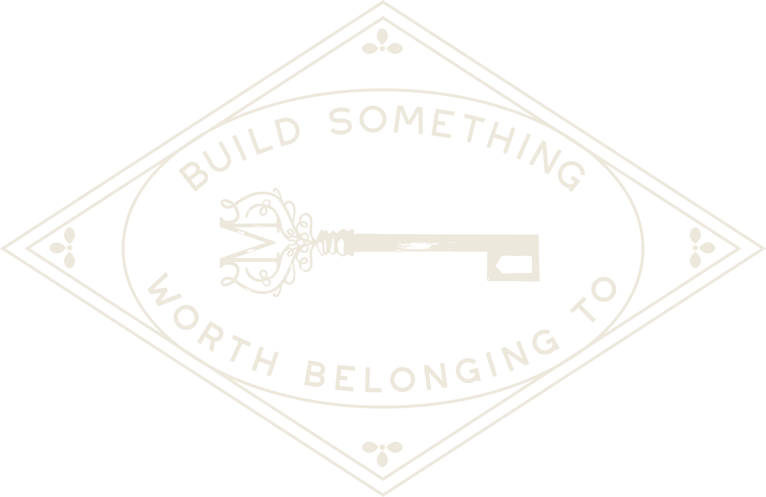
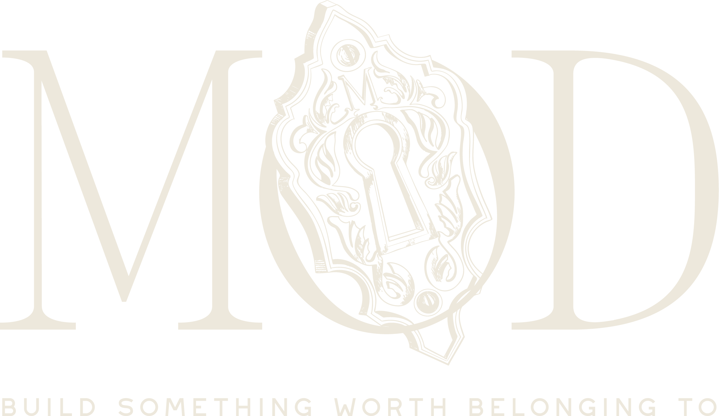
The foundation: market positioning, audience and buyer definition, the core idea, naming, messaging pillars, the “build something worth belonging to” tagline, and a voice and tone that sounds like no one else in modular.
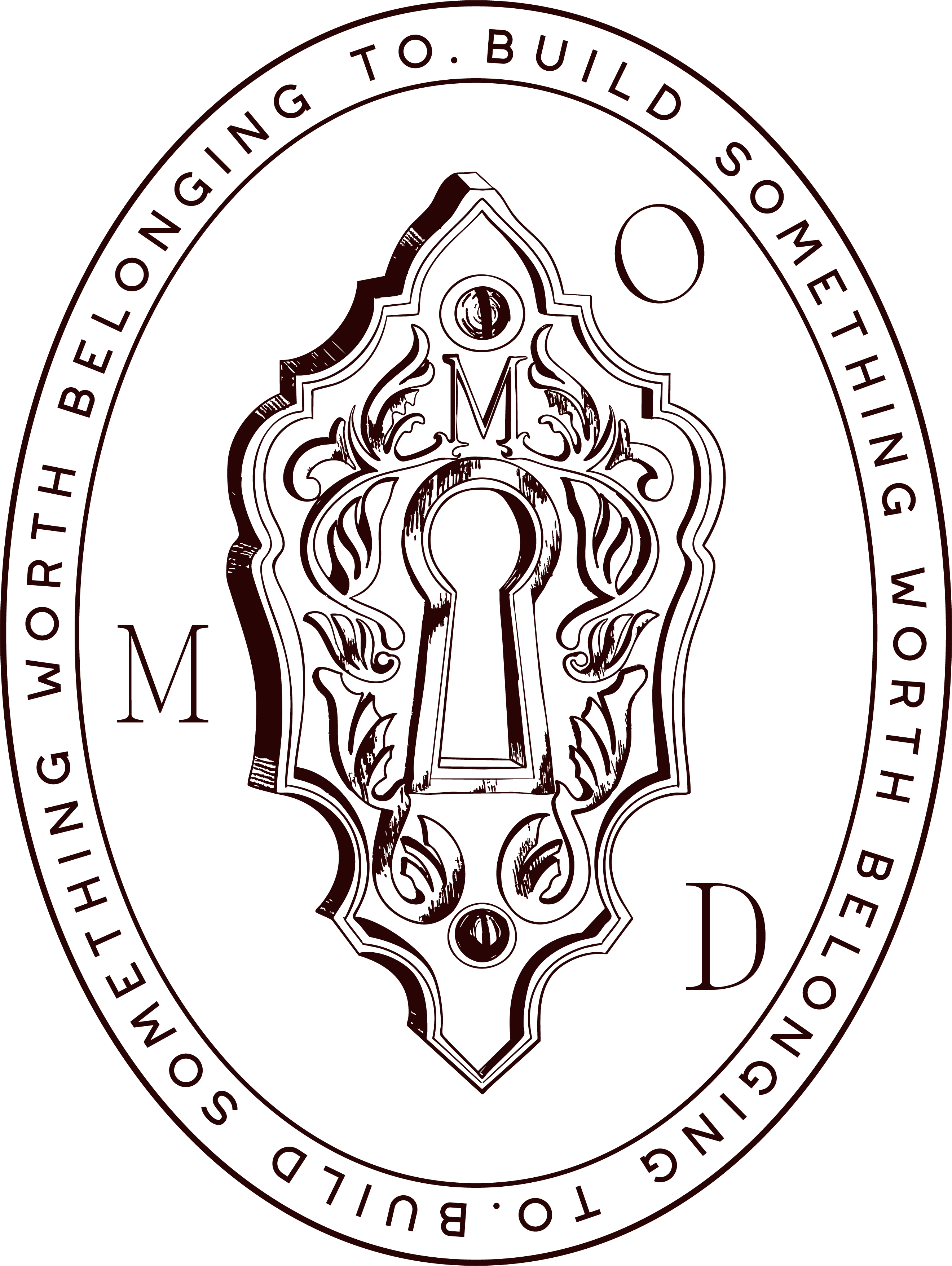
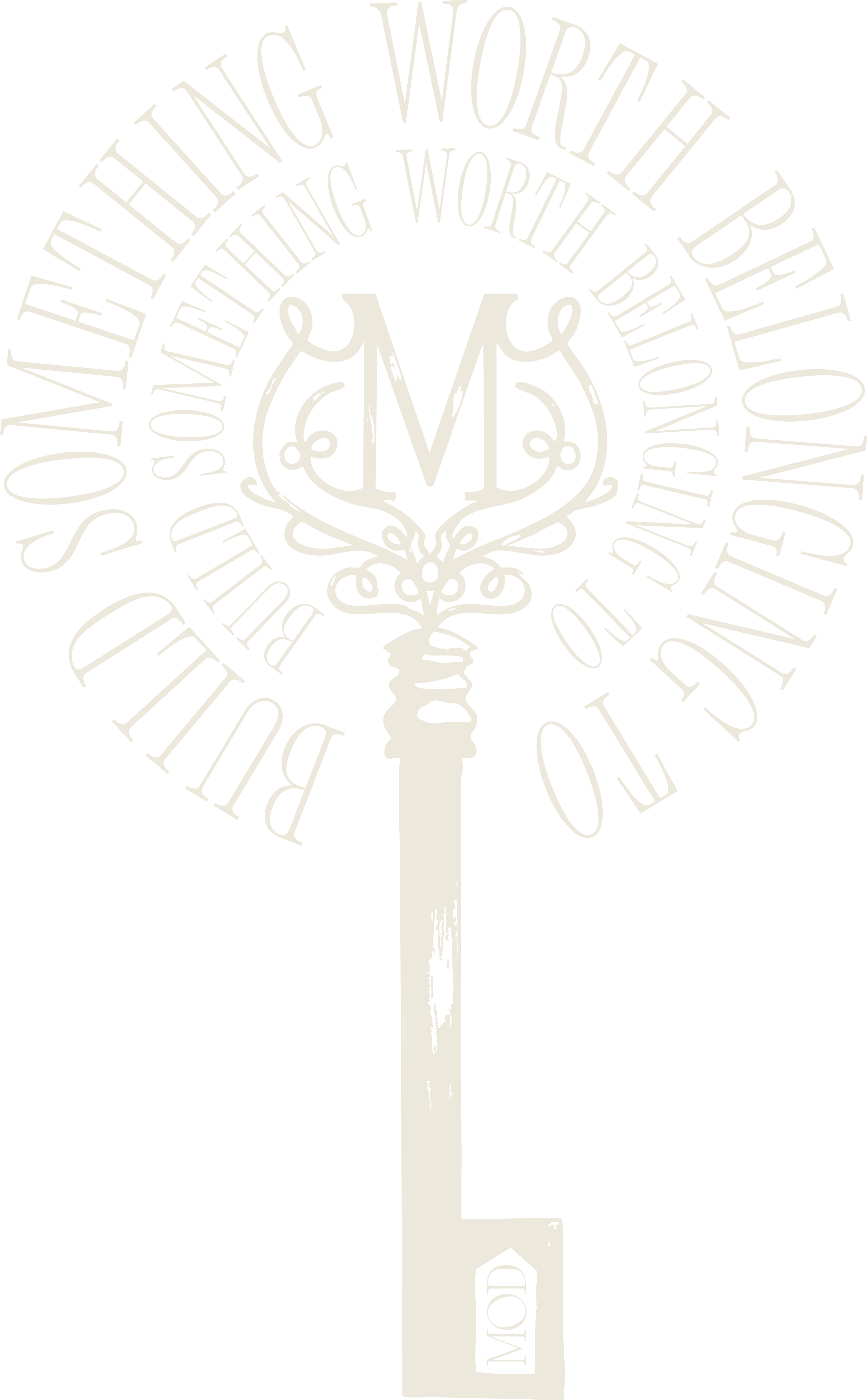
A full system: primary and secondary logos, an interlocking monogram, ornate keyhole emblems, wax seals, key marks, submarks, a favicon, and taglines, in a complete range of colorways.
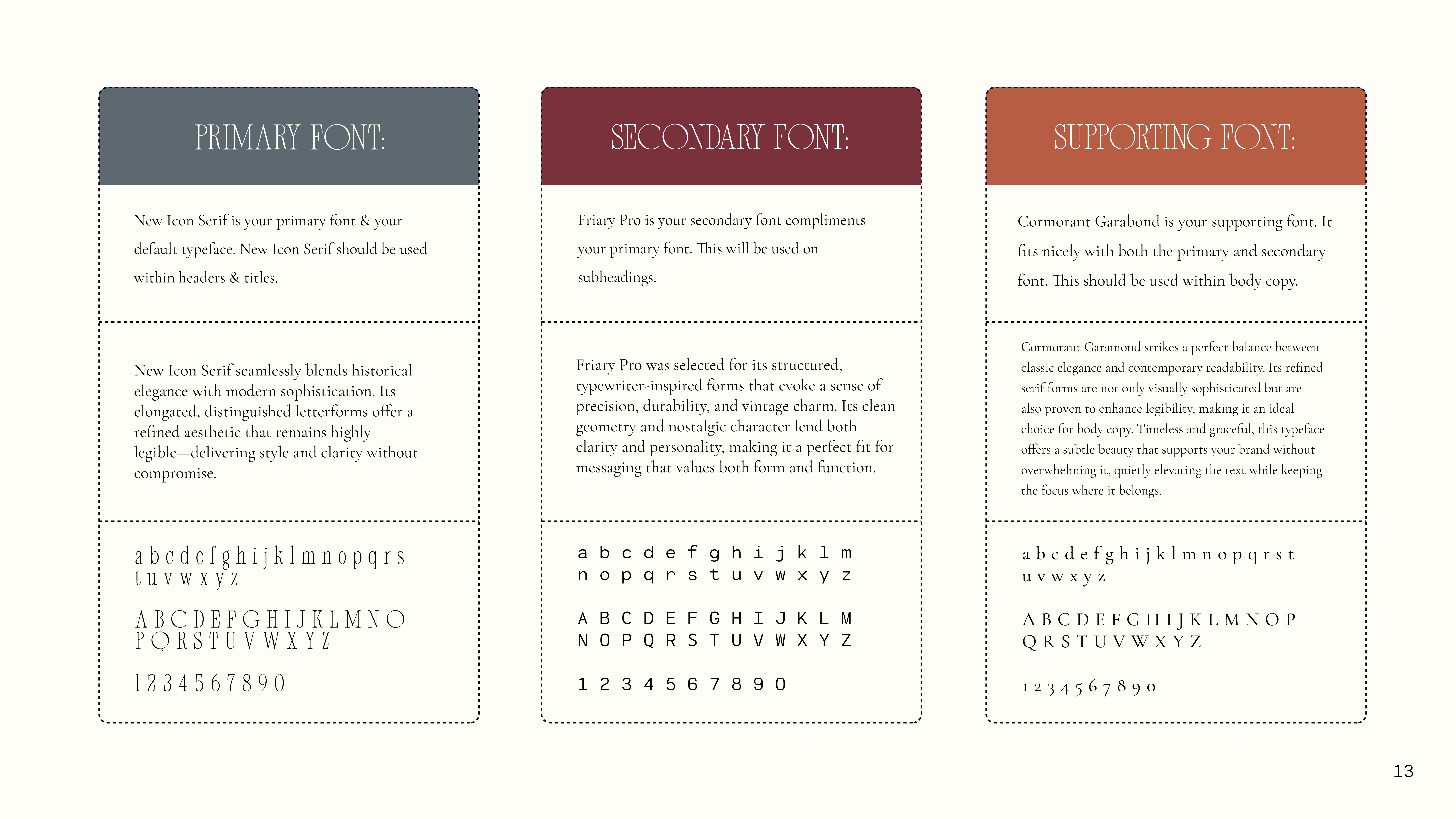
Mood boards and art direction, a primary and secondary color palette with usage rules, and a layered type system, headline, subhead, body, and script, all documented so every touchpoint stays unmistakably MOD.
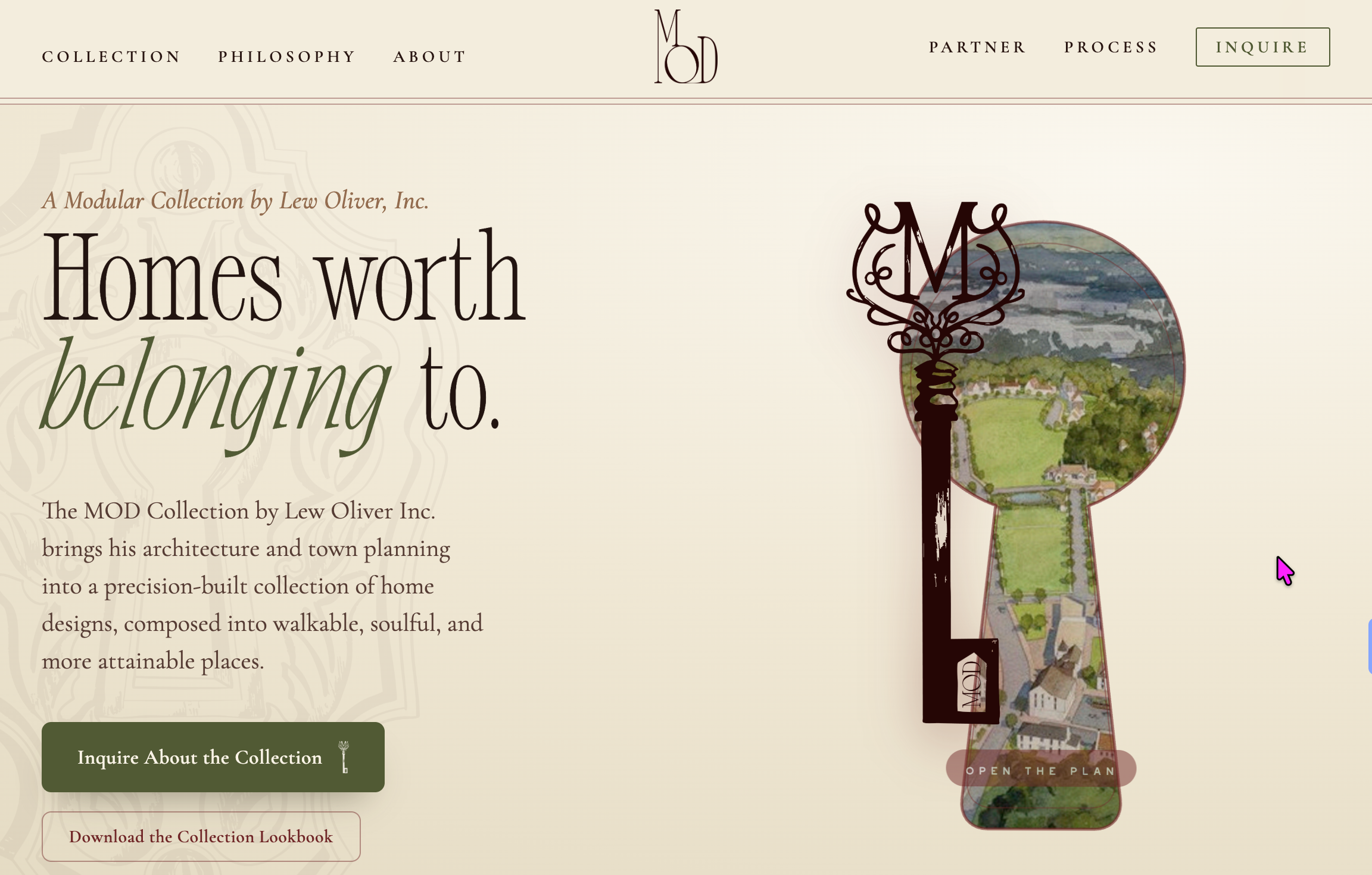
A concept homepage we designed so MOD could see what their website could look like, story-led and interactive. It is a concept, not live yet, built to make the vision tangible and anchor the pitch to developers and partners.
A print-ready and digital lookbook that sells the vision page by page, the story, the homes, and the place they make. A leave-behind that keeps working long after the meeting ends.
Presentation decks and print collateral MOD uses to recruit developers and partners, every slide and page on-brand. The day-to-day tools that take the brand out into the world and win the build.
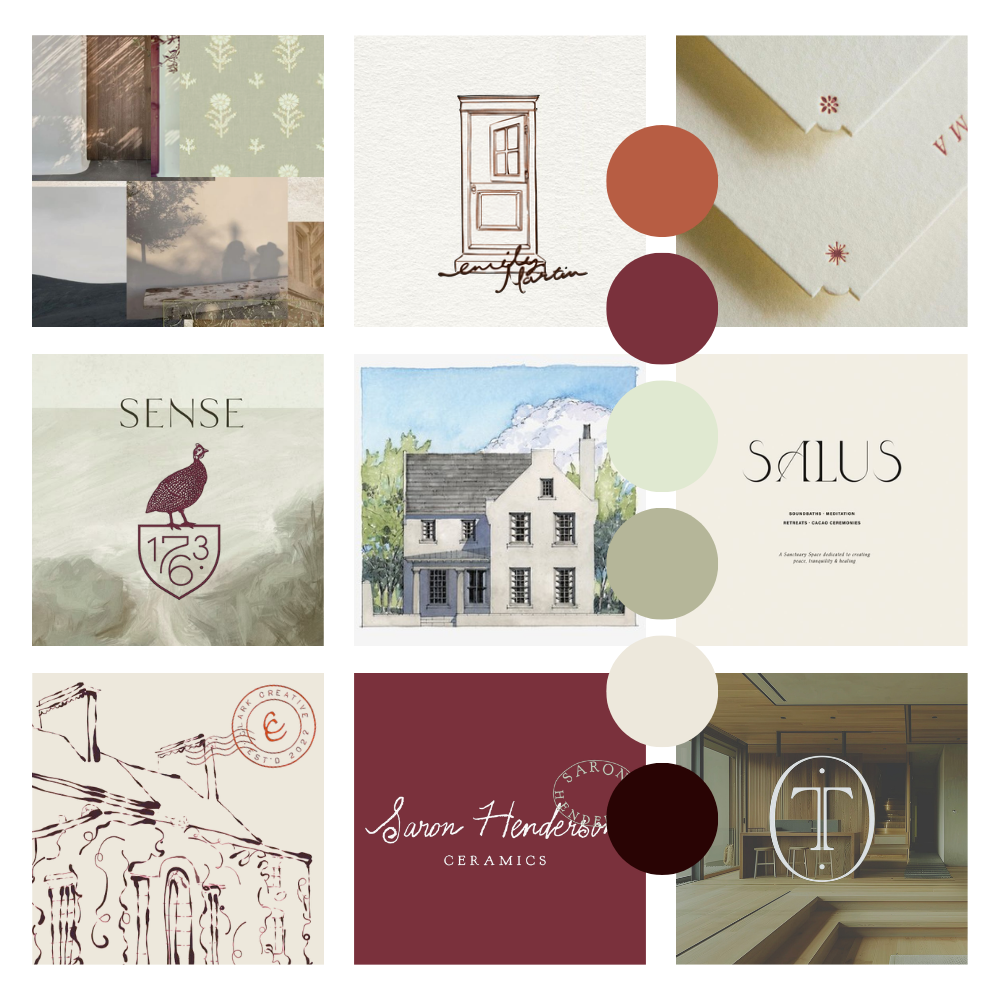
Before a single mark, we explored three directions for MOD, mood boards weighing palette, texture, and tone. This is the one Lew chose: heritage textures, hand-drawn architecture, a warm, confident palette, old-world craft met with modern clarity.
Every decision after this, the keyhole, the gold, the script, traces back to this board. That is how a brand stays coherent instead of becoming a pile of pretty things.
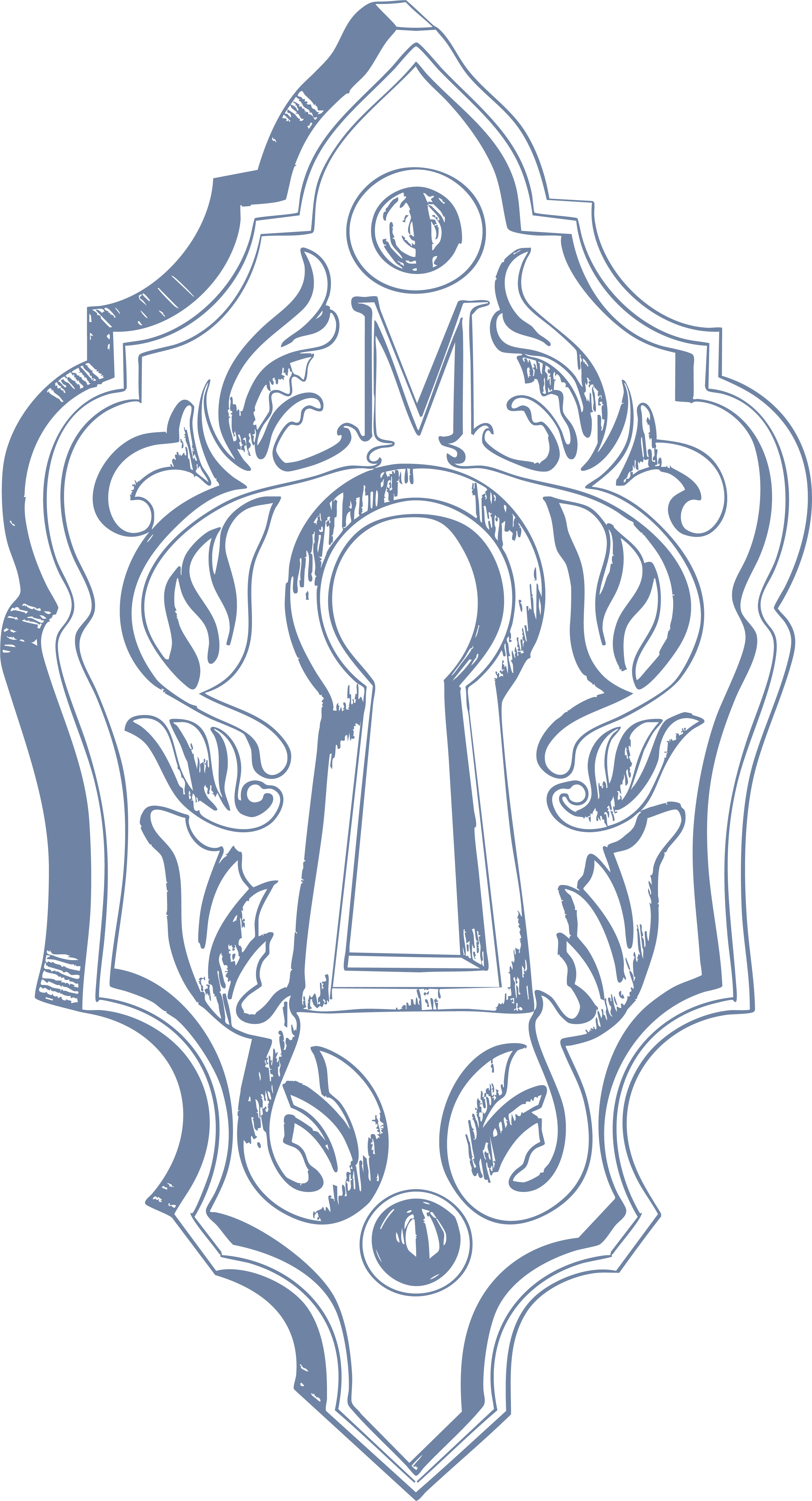
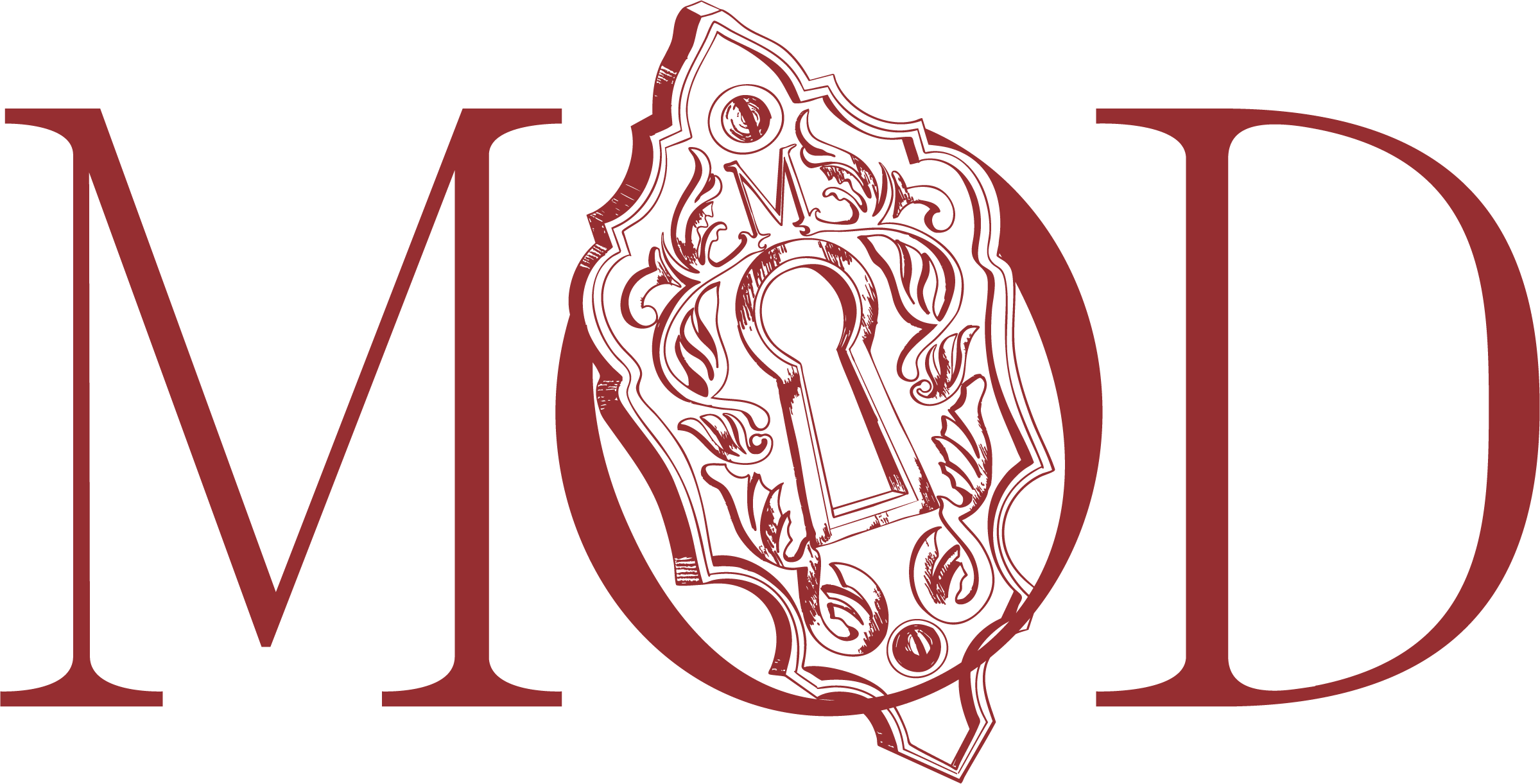
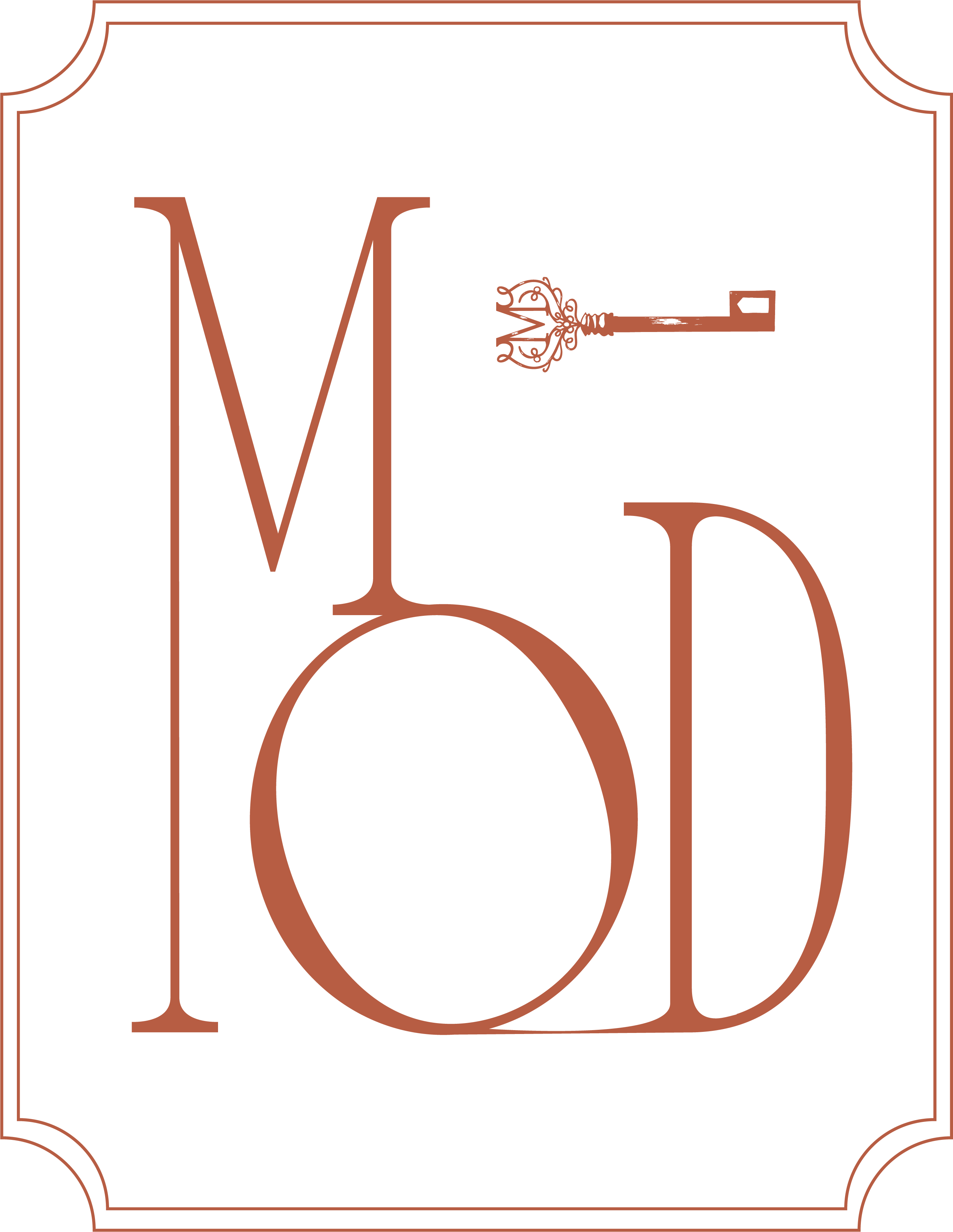
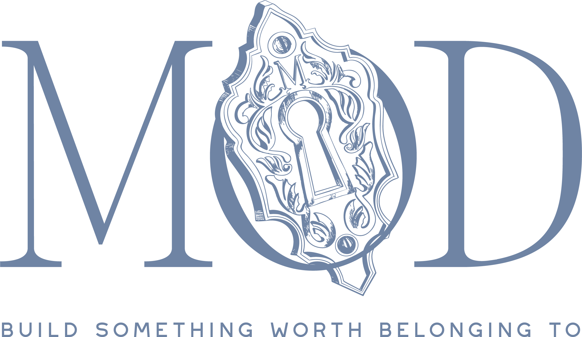
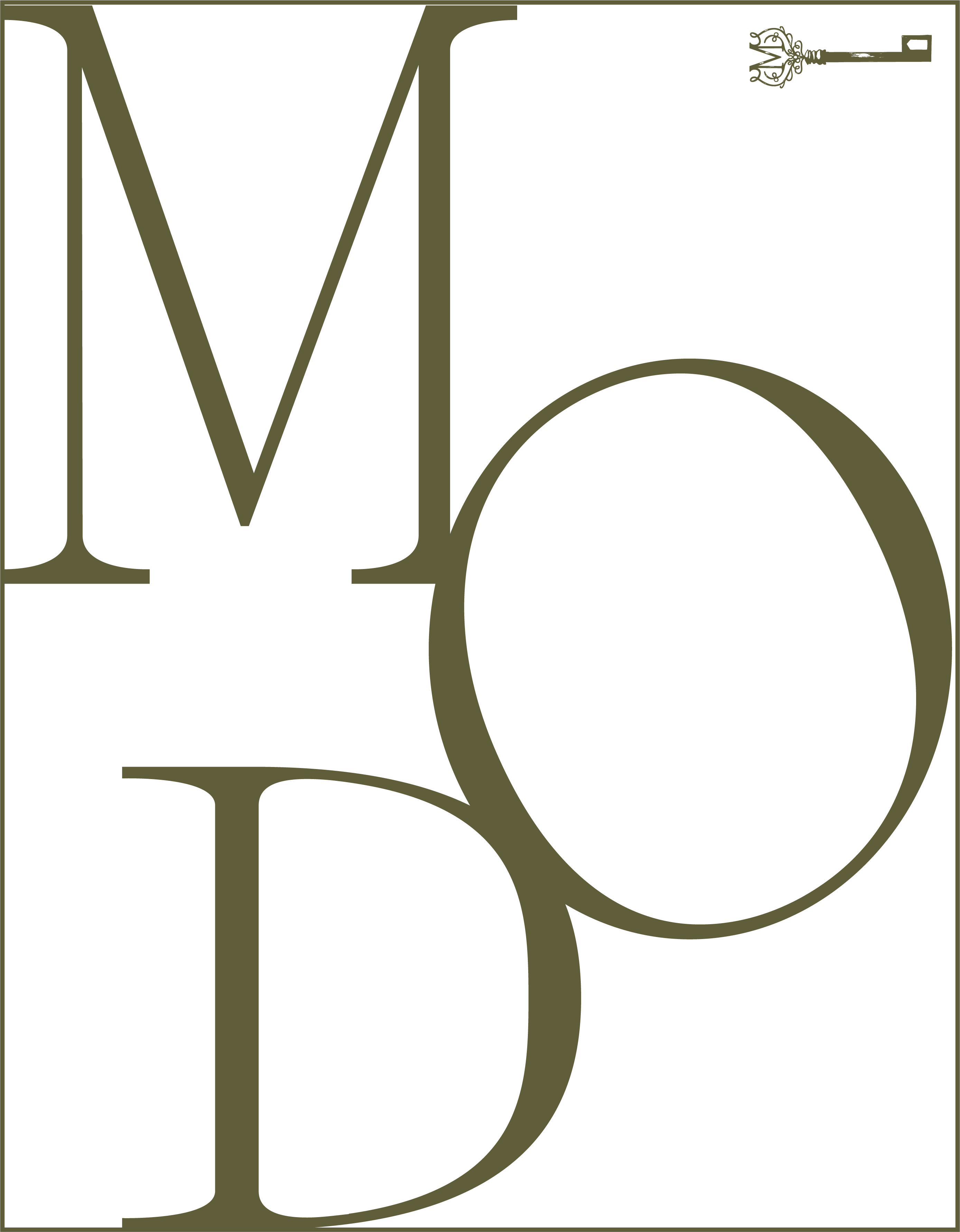
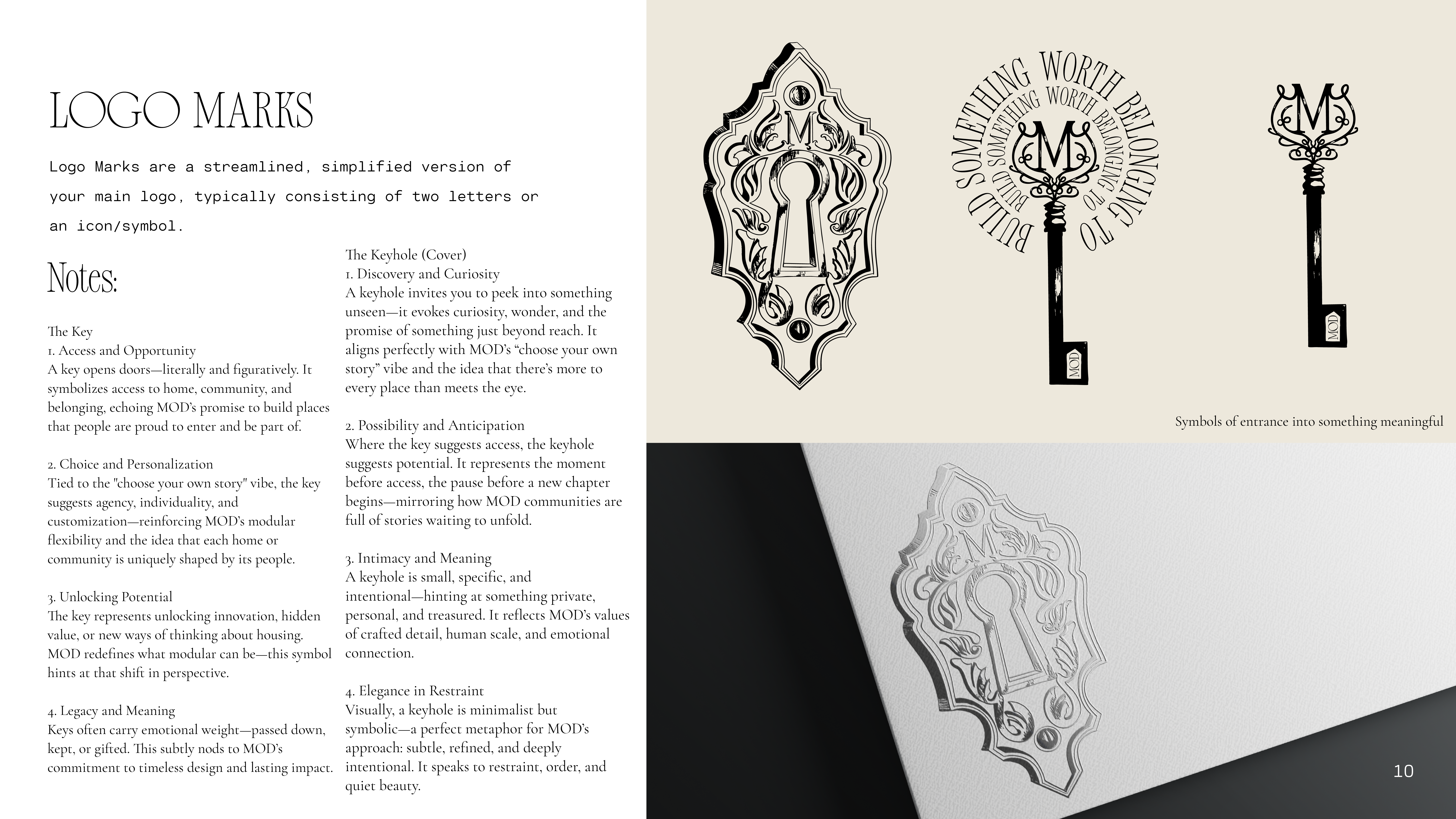
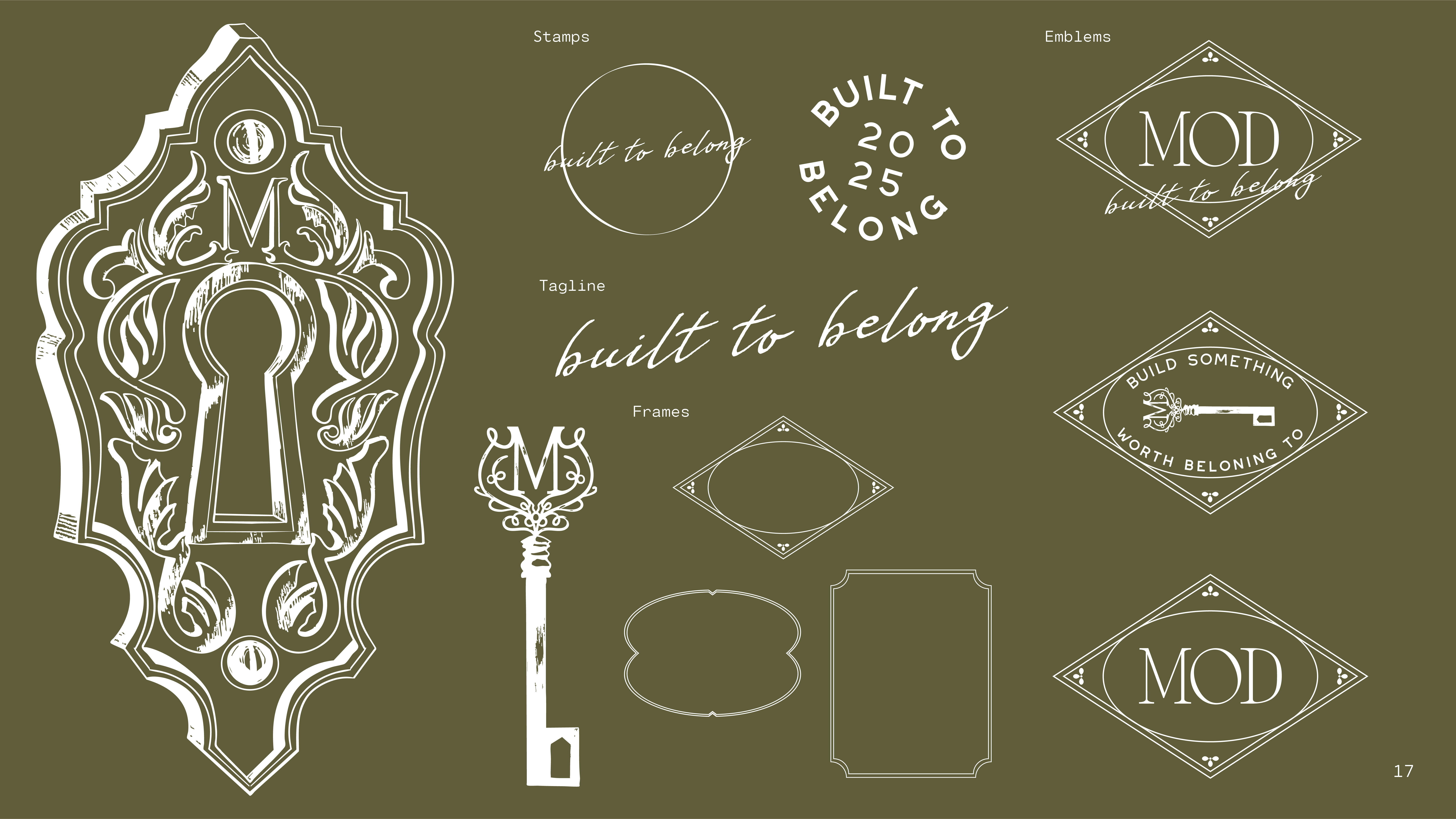
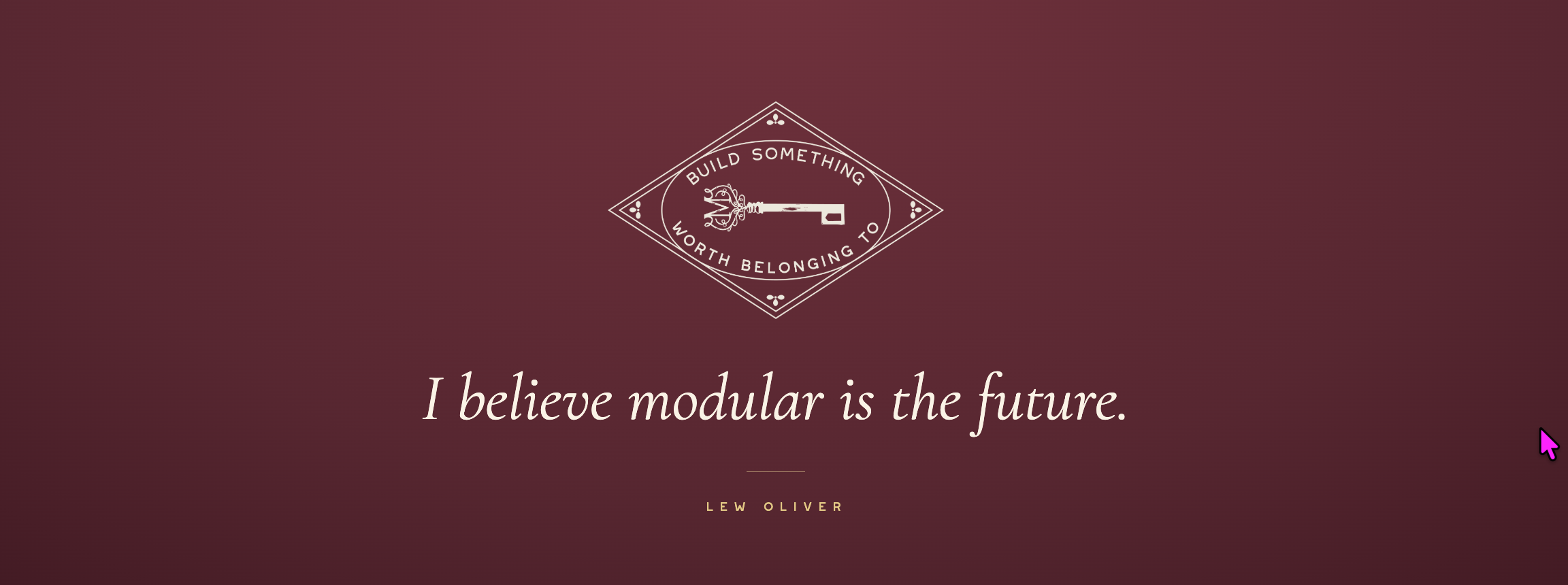
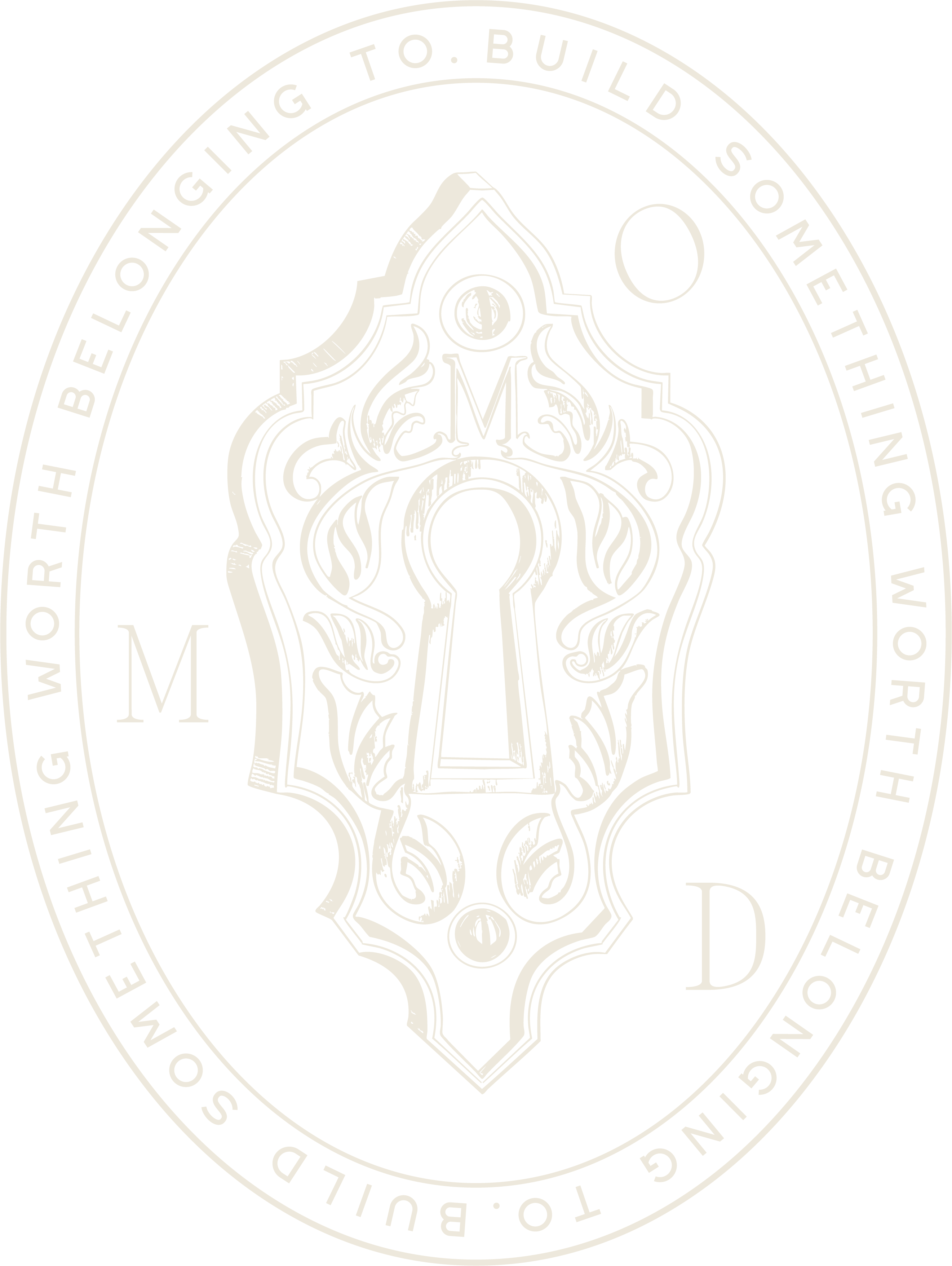
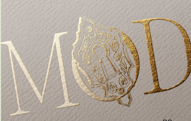
An antique keyhole hidden inside the O.
A key that turns it.
A promise built right into the logo: a home worth unlocking, a place worth belonging to.
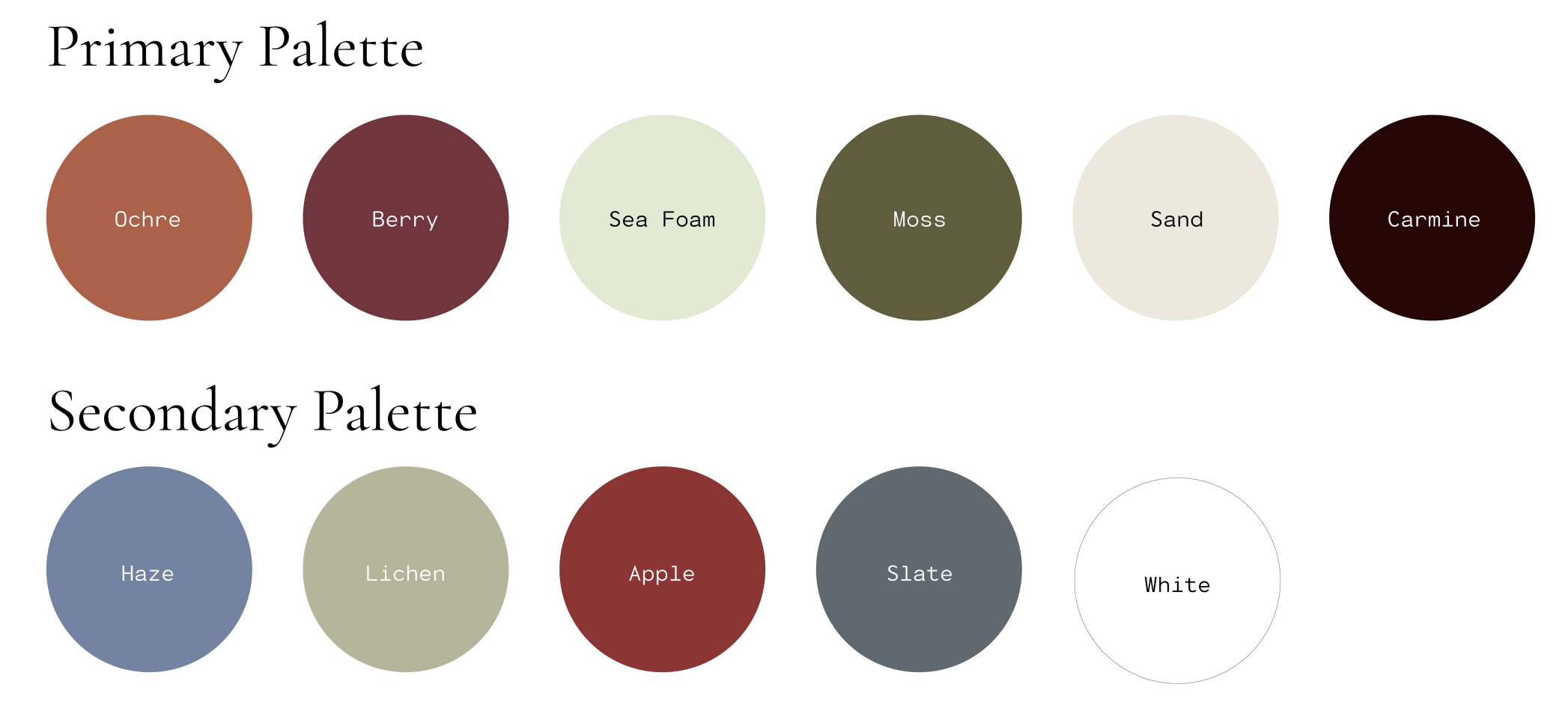
Color and type carry a brand further than any logo. Straight from the MOD brand guidelines: a full palette and a three-tier type system, documented so every touchpoint stays unmistakably MOD.
MOD is a modular architecture system created by urbanist Lew Oliver to deliver timeless, walkable communities at scale, a commitment to building soulful, enduring places where people feel they truly belong.
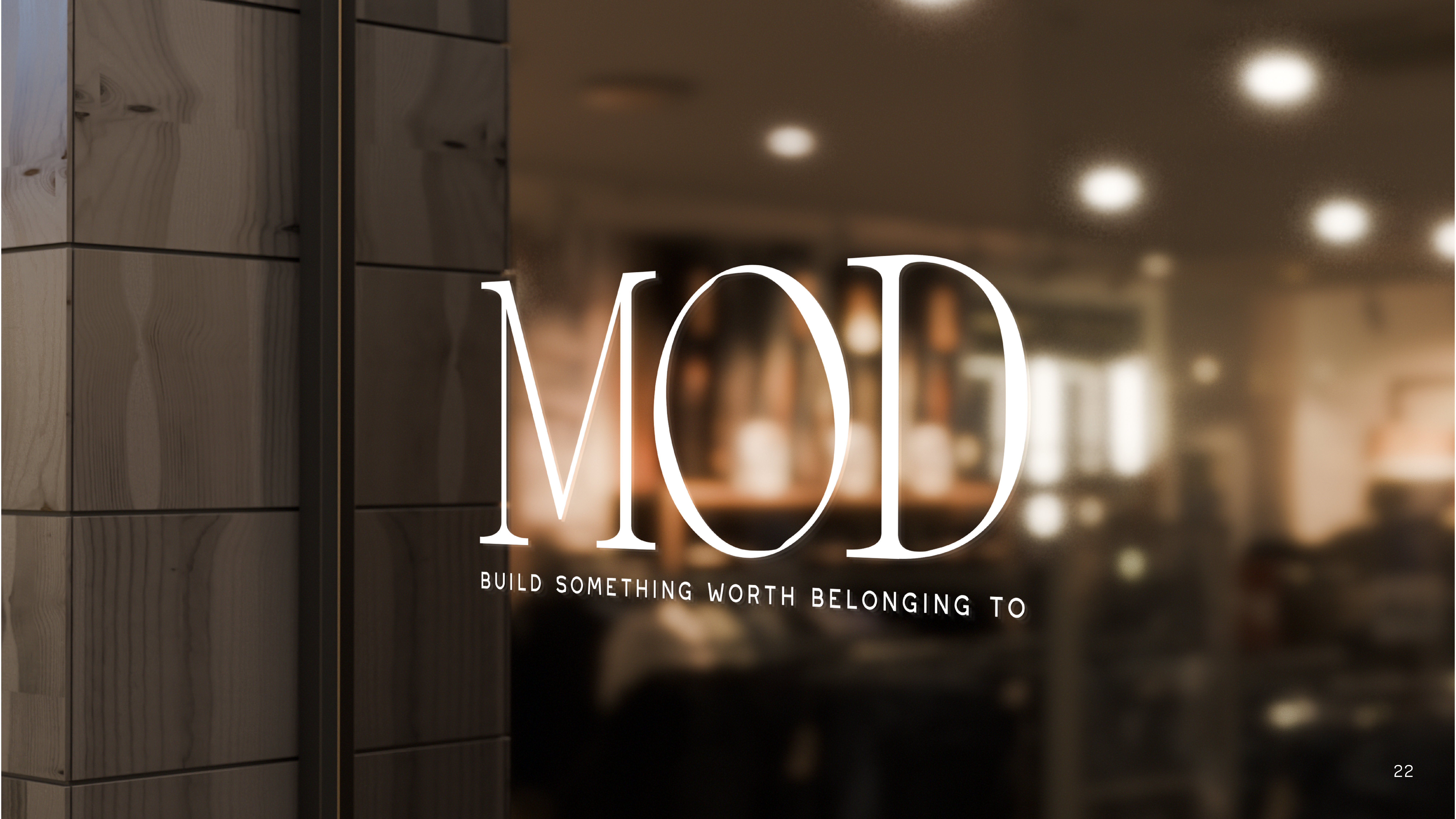
Anyone can look polished on a screen. A real brand holds up on a sign, a seal, a box, a foil-stamped card. We built MOD to land hard everywhere it shows up.
We designed MOD a concept homepage: an interactive,
story-led experience that lets a buyer feel the place before a single home is poured. It anchors our pitch to build the full site, alongside the presentation decks MOD uses to bring developers and partners on board.
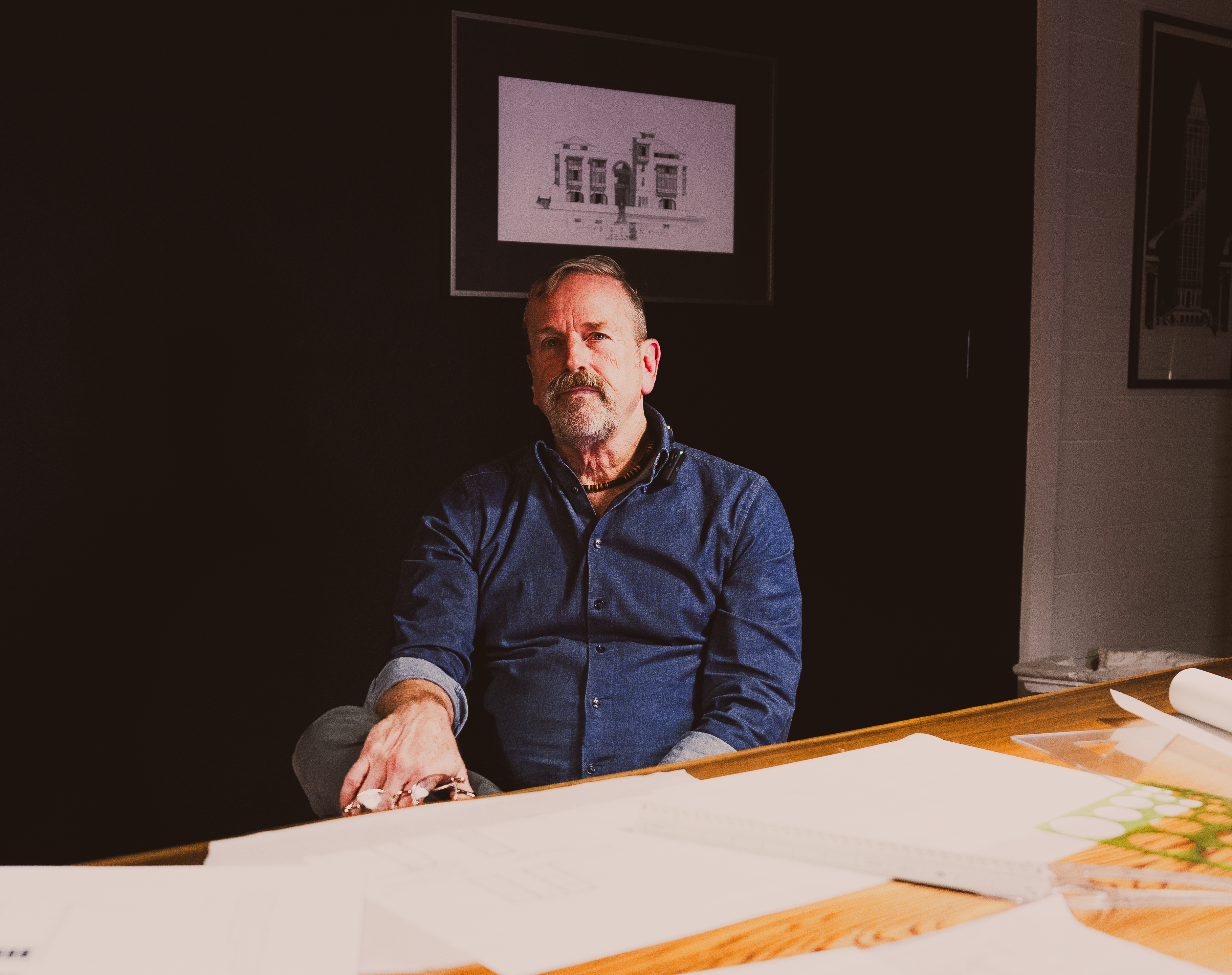
Lew Oliver is one of the most respected architects and town planners in America. His communities, Trilith, Serenbe, and Hartness, are the places other developers study and try to copy.
MOD is his boldest move yet: a brand-new collection of modular homes that brings that pedigree within reach of more people. An established name. A new brand. We built MOD to be worthy of both.
In the building industry, most companies sell close to the same thing. Brand identity is what makes one of them unmistakable and the rest forgettable. It is the logo, the color, the type, and the feeling that earns trust before a single word is read. MOD is what that looks like done right.
We Build Unmistakable Brands In The Building Industry.
Brand, web, and media, built so the best builders stop sounding like everyone else.
MOD is a collection of architect-designed modular homes from Lew Oliver Inc., built to bring walkable, soulful, and more attainable neighborhoods to life. Grit Blueprint created its brand identity.
Grit Blueprint built the entire MOD brand from a blank page: strategy and voice, the name, a logo and full mark suite, a color and type system, taglines, a concept website, a lookbook, and pitch and print collateral.
A brand identity includes positioning and voice, a logo and mark suite, a color palette, a type system, and guidelines that keep every touchpoint consistent. It is the logo, color, type, and feeling that make a company recognizable.
In the building industry most companies sell something similar. A strong brand identity is what makes one of them unmistakable and the rest forgettable, earning trust before a single word is read.
Lew Oliver is an award-winning architect and town planner behind communities such as Trilith, Hartness, and Serenbe, and the founder of Lew Oliver Inc., creator of the MOD Collection.
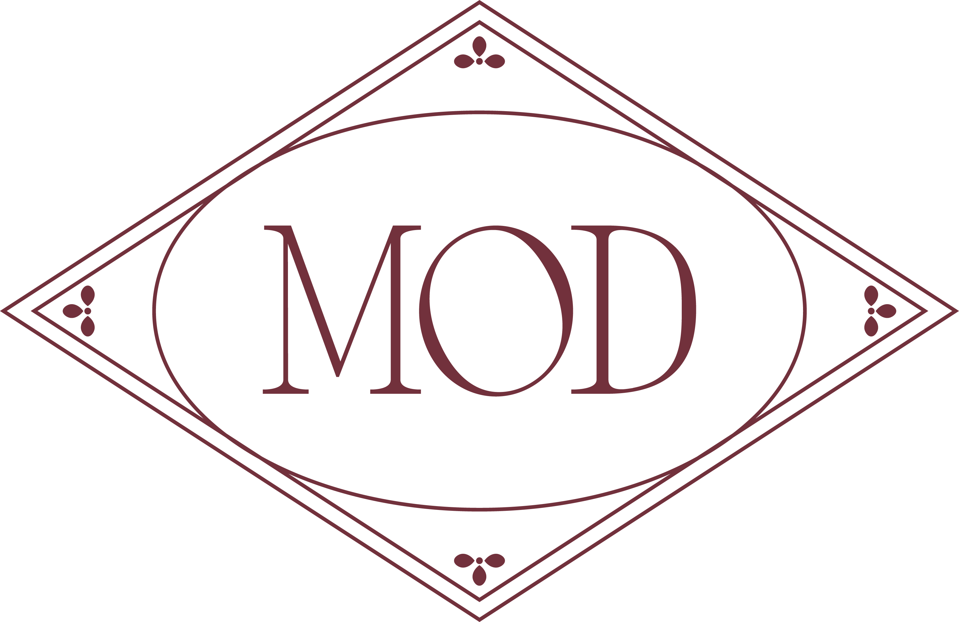
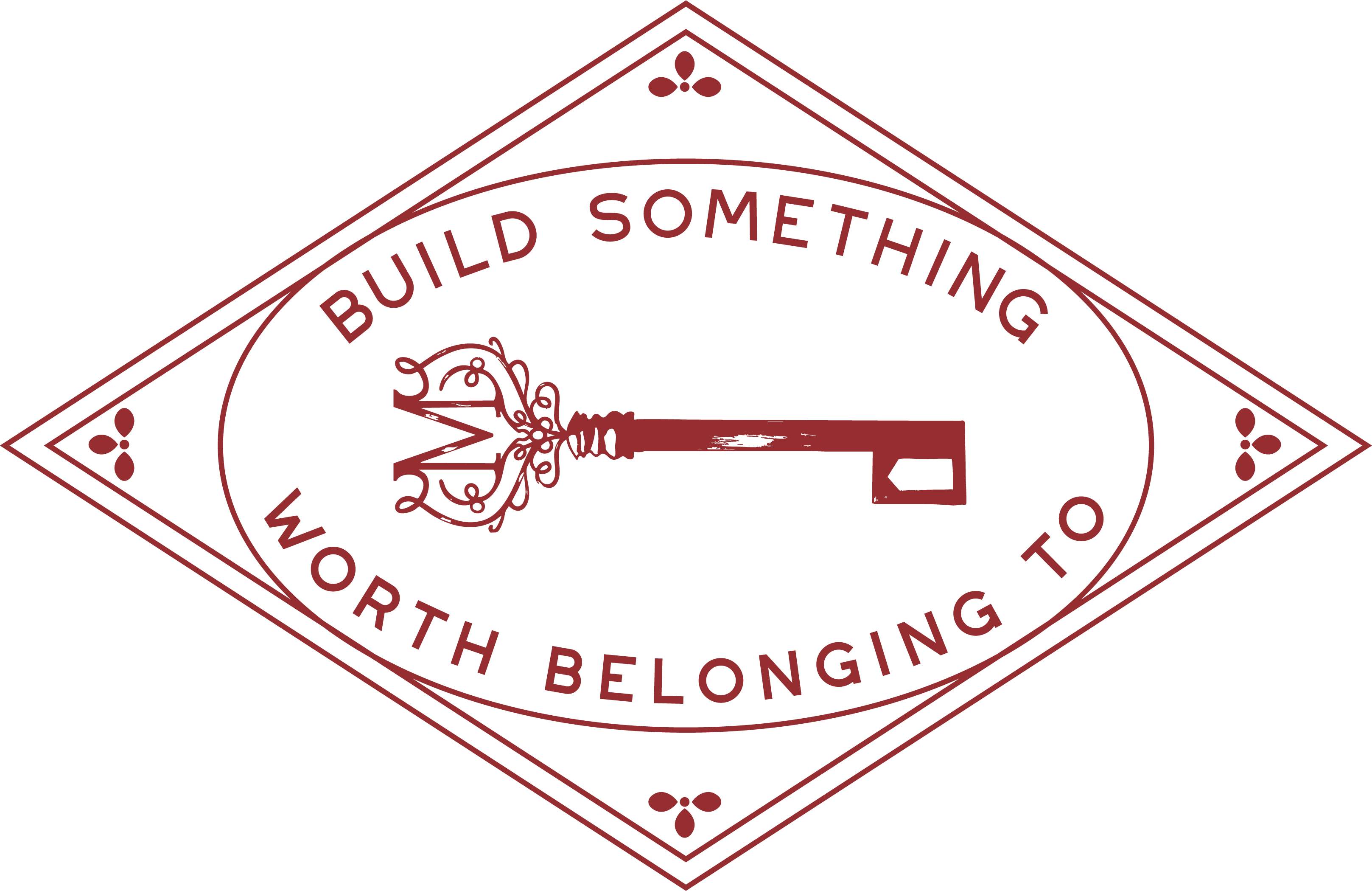
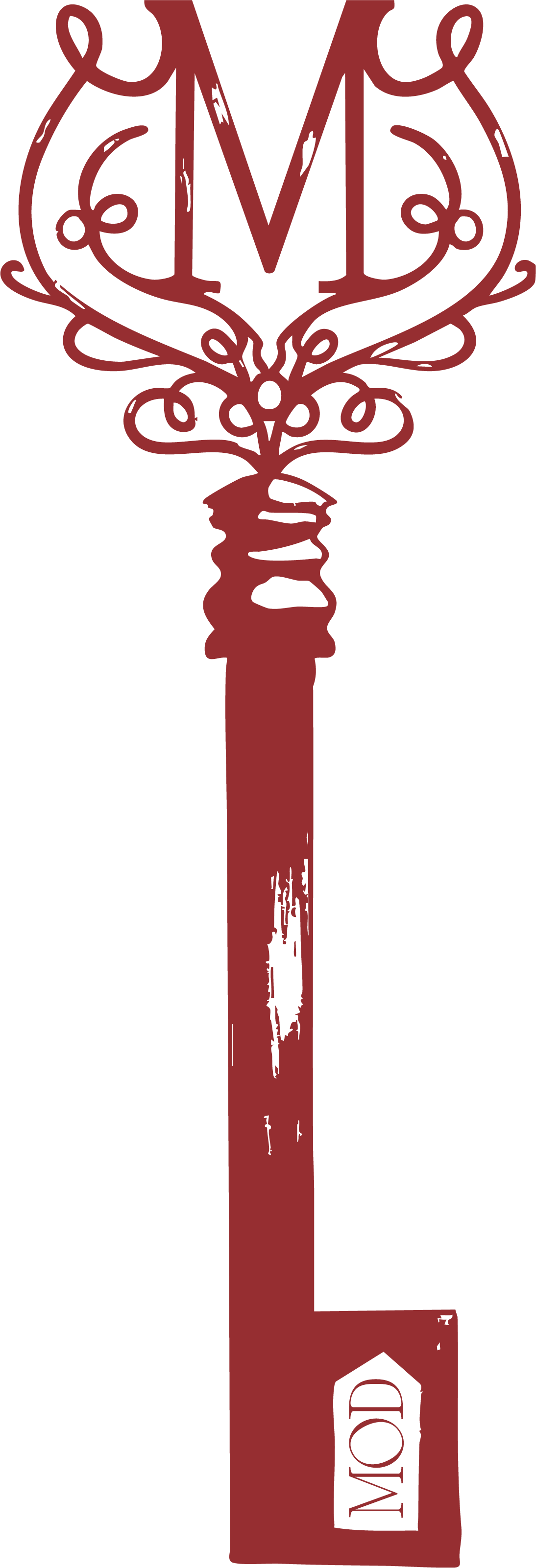
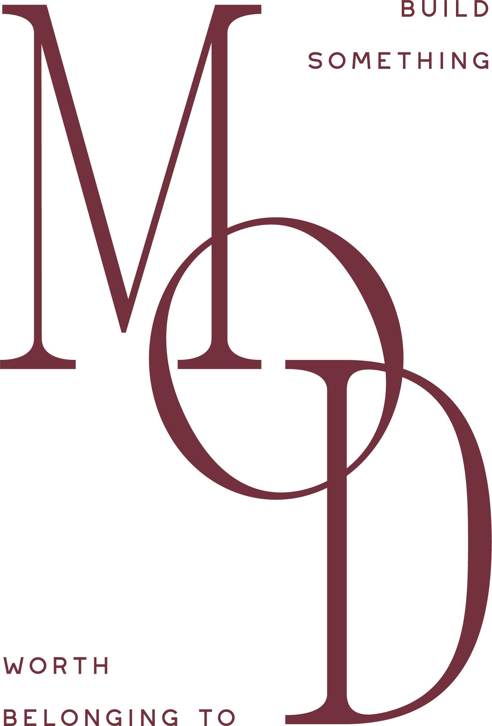
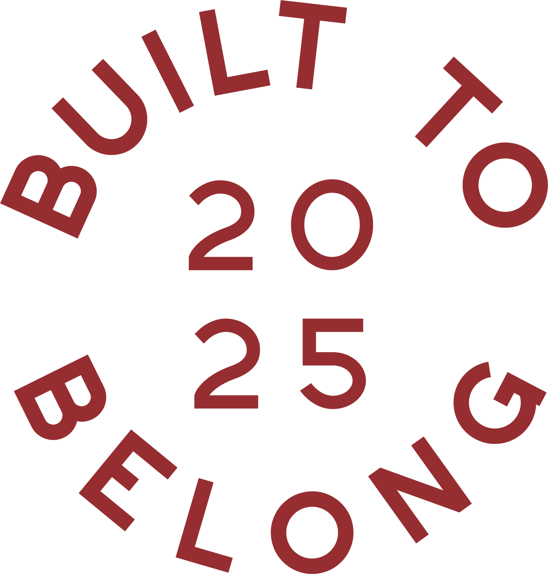
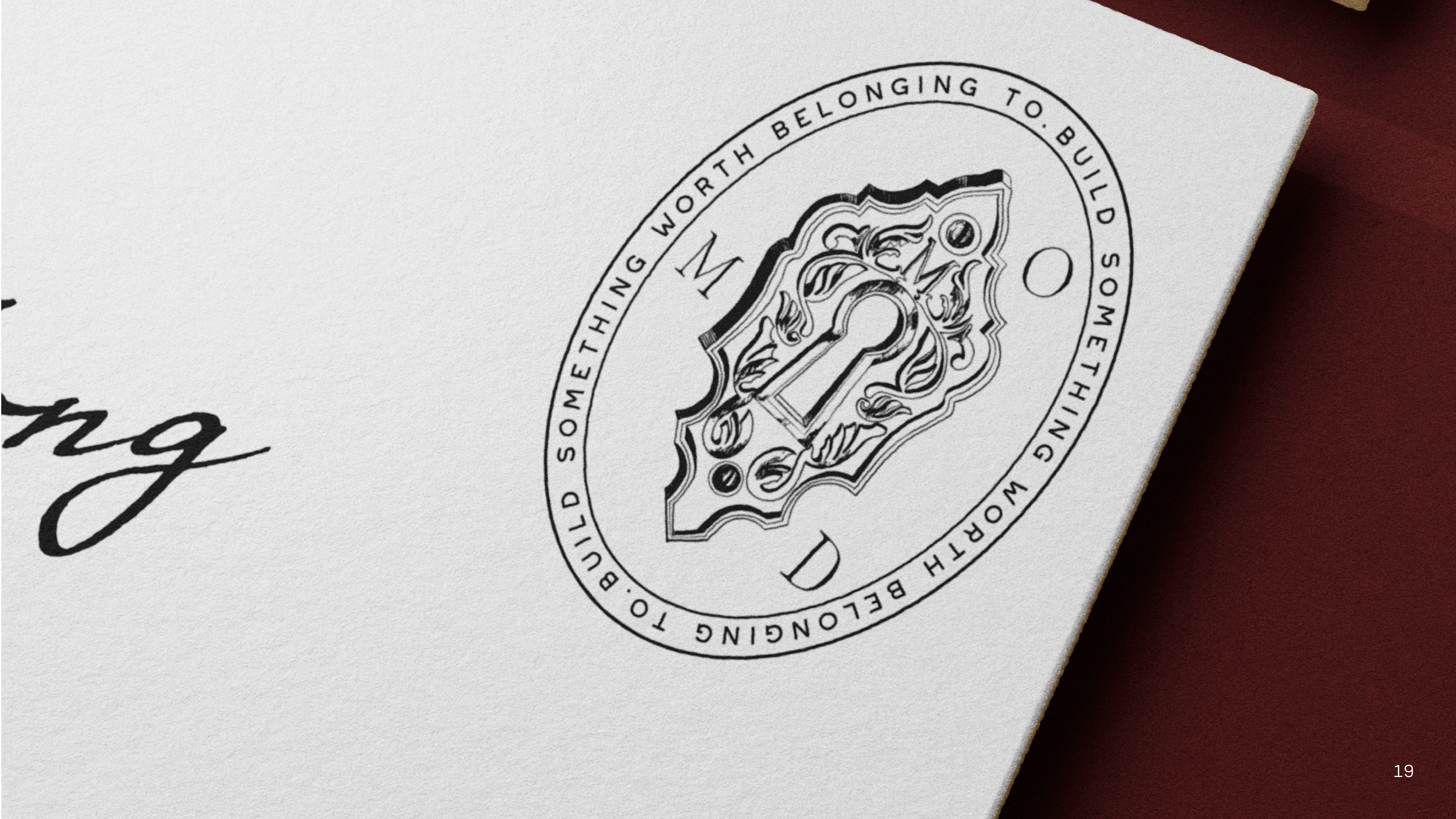
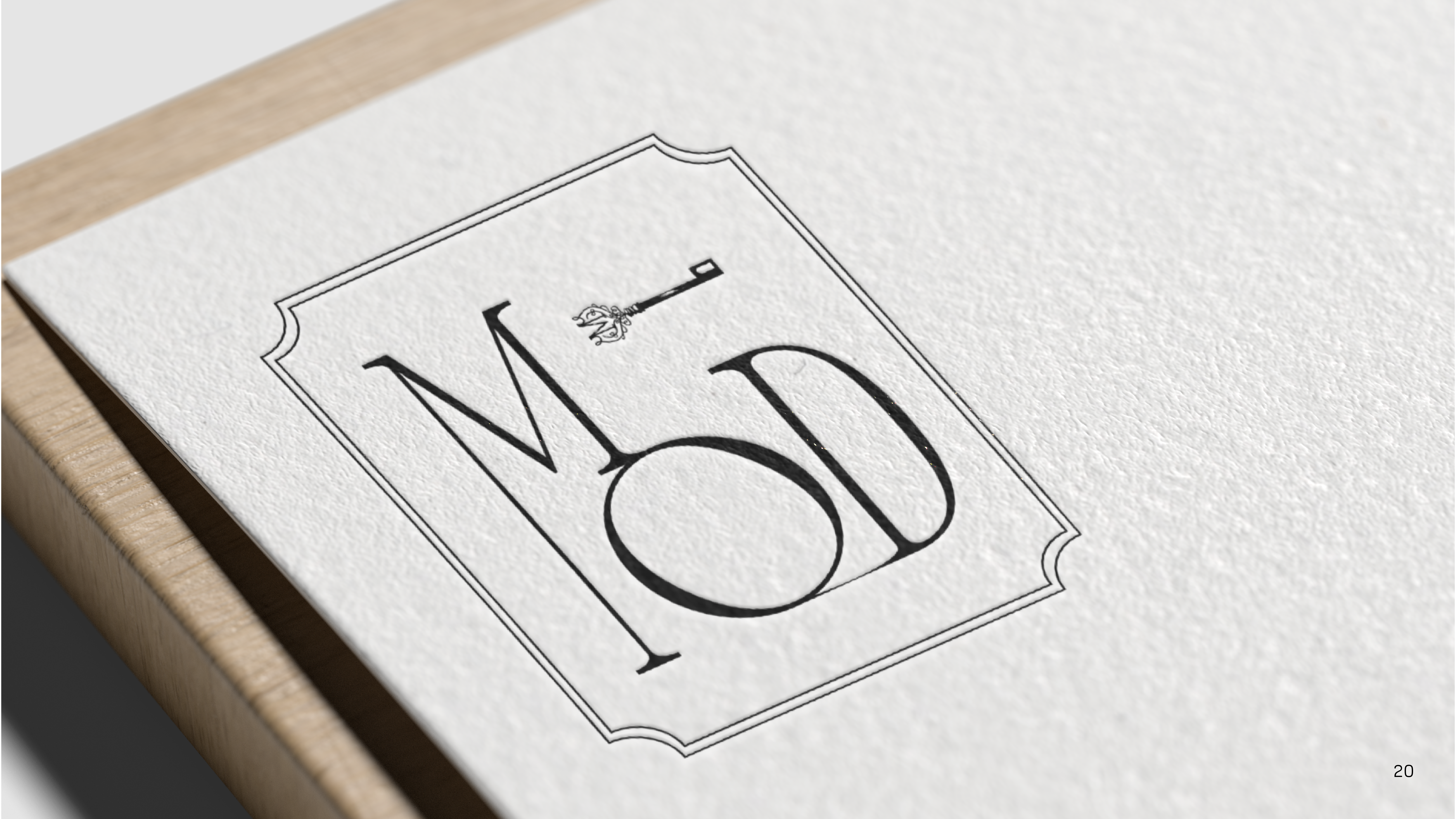
A full suite: a primary interlocking monogram, a secondary horizontal lockup with the keyhole nested in the O, stacked submarks, ornate keyhole emblems and crests, standalone key marks, wax-style seals, a favicon, and taglines. Each one is delivered in the complete MOD color palette so there is an on-brand option for any use.
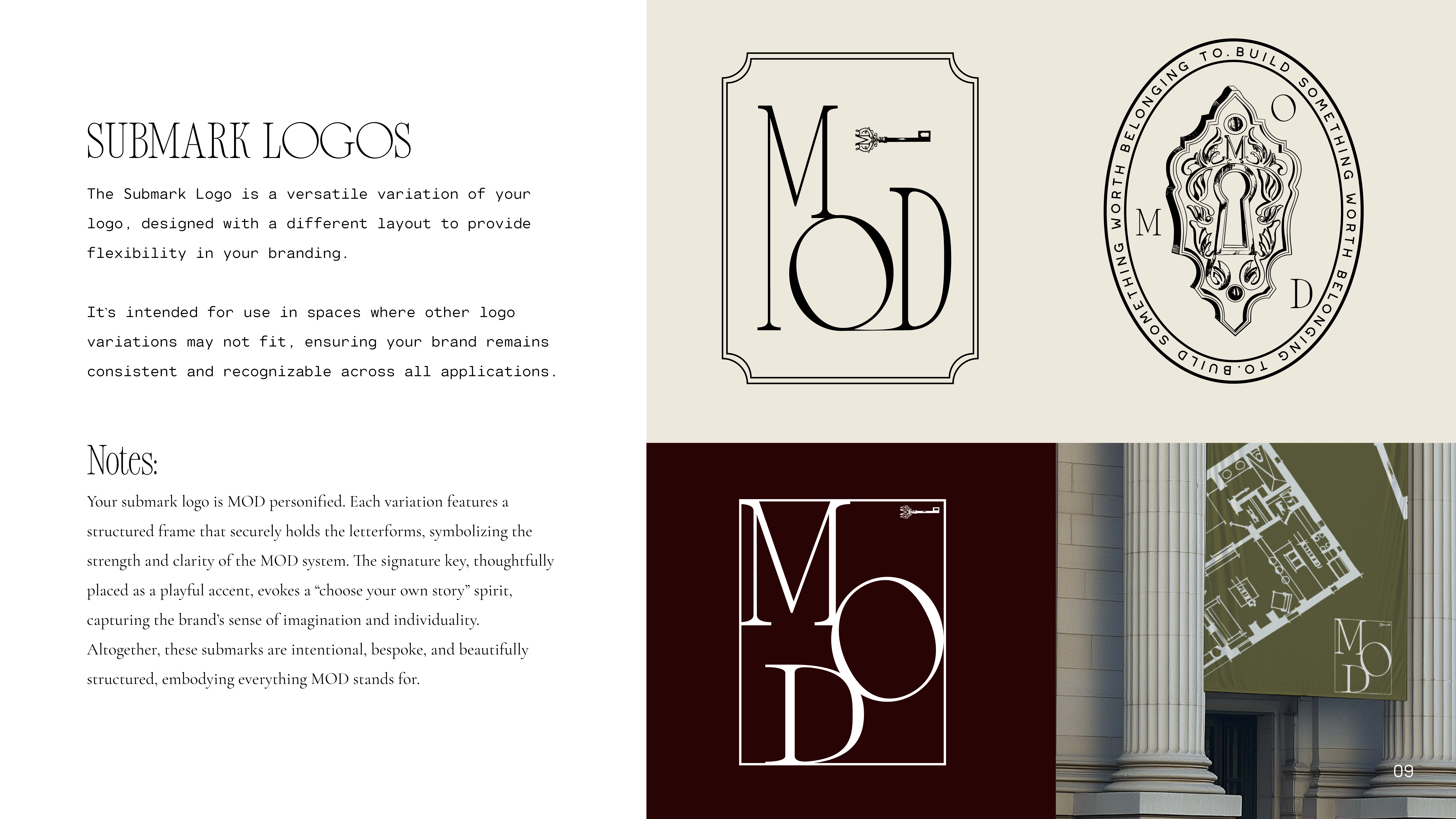
The primary logo is the main signature, used whenever space allows. The secondary, or alternative, logo is a different layout for places the primary does not fit. A submark is a small, simplified mark, like a favicon or stamp, for tight spaces such as a social avatar or a corner of a page.
A logo mark or emblem is a symbol that stands in for the brand without spelling out the name. MOD’s is the antique keyhole and the ornate key. Having several variations, seals, frames, diamonds, and the key, lets the brand stay recognizable across very different contexts, from a foil-stamped card to a storefront sign, without ever looking off-brand.
A primary palette of Ochre, Berry, Sea Foam, Moss, Sand, and Carmine, plus a secondary palette of Haze, Lichen, Apple, Slate, and White. Type is a layered system: a display serif for headlines, a refined serif for subheads, a clean serif for body copy, and a script for accents, documented so every touchpoint stays consistent.
Yes. Brand is the foundation, but we also design and build websites, like the MOD concept homepage, along with media and marketing collateral, so the brand shows up consistently everywhere a buyer or partner meets it.
Lew Oliver on building the MOD brand with Grit Blueprint, and Liz Treadwell on the experience.
Grit Blueprint helped us bring the MOD Collection to life. Stefanie and her team shaped the marketing materials, the logo, the graphics, and the thinking behind how we change the public perception of modular construction. They helped us position MOD Collection as superior construction, with high-quality, elegant finishes and a clear role in the future of walkable neighborhoods. Grit is creative, energetic marketing that brings clarity and purpose to the surface.
You took these ideas and transformed them into blueprints, as you do, and gave us an entire suite of options for marketing, for leading conversations with prospective clients, and a blueprint to adhere to internally. You produced the information in a new way we hadn’t even thought of ourselves. You showed us so much creativity, and that is critical for us. We can’t be a design firm and present information in a non-creative way. Your process, and what you produced, was perfectly in line for us.